https://youtu.be/w2H8xONts5I
https://youtu.be/AXhfn6bZVwA
https://youtu.be/K2g5EEEhdP4
https://youtu.be/L5F_A2NzrLw
https://youtu.be/p-G3Hw0novE
https://youtu.be/w2H8xONts5I
https://youtu.be/AXhfn6bZVwA
https://youtu.be/K2g5EEEhdP4
https://youtu.be/L5F_A2NzrLw
https://youtu.be/p-G3Hw0novE
ARE GREEN SCREENS KILLING THE MOVIES?
It’s easy to be cynical about green screen work and computer graphics; to say that they’ve made movies increasingly artificial and soulless. Many, myself included, are quick to bemoan the loss of practical effects, in-camera tricks, and techniques like matte painting and stop-motion. However, what makes a given movie good or bad is seldom the specific tools that were used in its creation – a movie’s quality is determined by how those tools are used. The reality is that you see much more green screen work and CG compositing than you realize. Projects that we don’t immediately think of as effects-heavy, like network TV shows, use green screens all the time for things like background replacement and vehicle insertion.

The following video is the 2014 showreel for an effects company called Stargate. They do a lot of compositing work that simply blends away into the background, unnoticed by the viewer.
https://www.youtube.com/watch?v=D2l3scv5Gj8
The next video is an essay from Rocket Jump Film School. It’s a very thoughtful look at why CG special effects work – or don’t – along with how effects change how we think of films.
Green screens, compositing, and computer effects are not going anywhere soon. Film has been continuously evolving since its inception and new tools will continue to be invented. It’s up to the filmmakers to use these tools in effective, compelling ways.
Here’s one more video from Mark Vargo, a visual effects artist who was working at ILM during the production of The Empire Strikes Back. It’s a fascinating, detailed look at the way compositing was done before software streamlined the process. It’ll definitely make you appreciate how far we’ve come.
COLOR CORRECTION AND GRADING
Few things transform a project like color grading. Just like altering music can take a scene from sentimental to scary to silly, color grading can completely alter the feel of the footage you’re working with. Some feature films have incredibly stylized color grades – think about how different O Brother, Where Art Thou?, The Matrix, 300, Traffic, or Moonrise Kingdom would be without their distinctive color palettes. Even on films where the color grading doesn’t draw attention to itself, the look of the film is always a conscious choice.
Until relatively recently in the history of cinema, color grading was a purely chemical process. Film negatives could be exposed to different chemicals for different amounts of time to bring out the reds, greens, or blues in the image (this is why color correction is sometimes referred to as “color timing.”) Additionally, various bleaches, washes, and other photochemical processes could be used to affect the final image.
The advent of digital post-production has made this process more about art and less about science. While it’s still important to be knowledgeable of the process and thoughtful during filming, color grading has become increasingly accessible and adaptable. The most recent iterations of Premiere (since CC 2015) have added a new suite of tools, allowing you to do fairly sophisticated grading from directly within the editing program.
Fixing Color and Creating Style
The terms “color correction” and “color grading” are used fairly interchangeably, but I’d like to draw some distinctions between the two. I think of color correction as the initial step – the process of getting your footage to match and fixing any glaring issues. Most often, this entails basic fixes to things like white balance and exposure. I think of color grading as the step where you take your corrected (“fixed”) footage and stylize it. This may involve things like the saturation, warmth or coolness, and contrast. It’s also the stage where you would add effects such as a vignette or film grain.
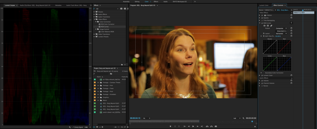
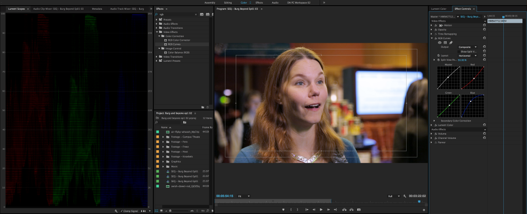
One of the additions to the CC 2015 version of Premiere is the “Color” workspace, which can be accessed from the bar at the top of the program or the Window dropdown menu. The Color workspace is designed around the new Lumetri Color effect, which is Premiere’s most extensive color feature. Lumetri is essentially a simplified and condensed version of SpeedGrade (Adobe’s dedicated color grading software) running within Premiere. The Color workspace also adds a reference panel displaying “Lumetri Scopes,” which can be configured to show image information such as a histogram, vectorscope, or parade. We’ll be using the RGB parade, which shows the spectrum of red, green, and blue within an image.
In a “balanced” image, there will be roughly the same amount of red, blue, and green in the entire image. In terms of exposure, most of the RGB parade should be in the middle of the graph. Of course, if your shot is intentionally dark, light, or features a certain color prominently, your RGB parade will look different. It takes some time to get used to reading scopes, but they can be a great way to quickly see where the potential issues are in your image.
Before we dive into Lumetri Color, let’s look at color correction at its most basic form, using the RGB Curves effect (note that you may need to locate the Effect Controls panel using the Window dropdown). RGB Curves allows you to adjust the three primary colors in the image using points on a line graph. The brightest white is located in the upper right corner and the darkest black is in the lower left. By placing and manipulating points on the curved line, you can change the amount of each color in the image. The white “Master” line affects overall exposure. You should definitely take some time to play with this effect to see how an image can be changed. I often use the RGB curves to do a quick color correction pass to footage before diving into finer grading.


Lumetri Color
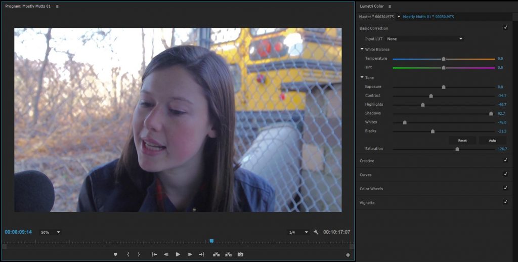
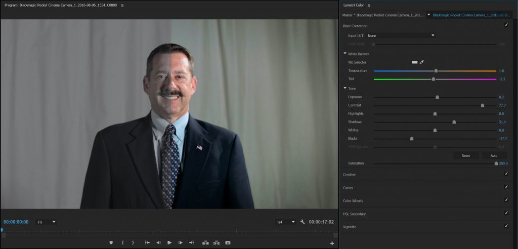
For more advanced color grading and styling, let’s move on to the Lumetri Color effect. Lumetri Color is in the Effects panel, under Color Correction, but it also has its own panel in the Color workspace. If you start making changes in the Lumetri Color panel with a clip highlighted, the Lumetri effect will be added to that clip automatically.

Lumetri Color is comprised of five sections: Basic Correction, Creative, Curves, Color Wheels, and Vignette. Basic Correction is made up of sliders to adjust the overall color temperature, exposure, and saturation of the image. The Basic Correction controls can be used to do the same kind of “quick fix” work that we just did with the RGB Curves effect, although I find that the RGB curves give a bit more control.
In the Creative section, you’ll find a number of preset “looks,” which can be quickly applied to your clip, as well as a slider to change how much the preset is applied. The looks can be fun to play with, but I’d encourage you to experiment with creating your own style by dialing in the different parameters yourself. Creative also has some tint and saturation tools which can be useful; in particular, there are color wheels for tinting the shadows and highlights. Often, you can give your footage an interesting look by tinting the shadows and highlights differently (such as cool shadows and warm highlights).
In the Curves section, you’ll find a set of RGB curves that are nearly identical to the effect we discussed earlier. The reason I prefer to use the Curves effect separately is that it allows me to apply a general fix before any of the Lumetri stylization. That being said, I will often use the Lumetri curves to further refine the look of the footage. There is also a “Hue Saturation Curve” which allows you to precisely control the saturation of different colors in your image.
Below the Curves section are the Color Wheels. These allow you to control the hue and saturation of the shadows, midtones, and highlights of the image individually. The three wheels replicate the physical controls used in a professional color grading suite – if you’ve ever seen a colorist using three large trackballs to adjust footage, that’s what these correspond to.
The last section of Lumetri Color is the Vignette. Pulling the “Amount” slider into the negative will add a dark vignette; pulling it into the positive will add a light vignette. A dark vignette is a quick and effective way to make footage look just a bit more polished and interesting. Vignettes draw the eye to the middle of the frame and the gradual falloff often makes backgrounds look more dynamic. That being said, it is very easy to overuse vignettes — ideally, the effect should be almost subconscious.
Flat/Log Footage
Because color grading has become such an integral part of the post-production process, many cameras now offer “flat” picture profiles or “log” modes. This footage generally looks worse right out of the camera – desaturated and without much contrast. The benefit of log-style footage is that a wider range of exposure can be captured, so you’ll be able to see more in the highlights and shadows. It’s also quite easy to add saturation and contrast to an image. Log footage allows you to color correct and grade the image more aggressively – it’s like having a neutral base to start from. The downside is that log footage really needs to be graded before it’s at all usable – the initial image just isn’t aesthetically pleasing.

Project 4: Crafting Color
Download this zipped file – it contains a folder with footage, sound effects, and a Premiere Pro project file. The file is somewhat large, around 2.5GB, so be aware of that when downloading. If you open the Premiere file (“Color Grading Project”), you’ll see that there are three sequences inside: Grade 1, Grade 2, and Finished Project, which contains nested copies of Grade 1 and Grade 2.
Your assignment for the week is to give Grade 1 and Grade 2 different color treatments. You’ll probably want to start with some basic correction: removing unwanted color casts and getting the individual shots in the sequences to match. From there, stylize the two sequences to make them unique. You might make one warm and idyllic and the other cold and mysterious. Or try playing with different genre looks: horror, noir, period drama, sci-fi, and so on. Use color temperature, saturation, contrast, vignetting, and the other tools at your disposal to give the same piece of footage two different looks.
Once you’ve finished working with Grade 1 and Grade 2, open the Finished Project sequence. You should see both versions of the footage along with a short title before each one. Put a name for each look in the appropriate title graphic. As an optional bonus, feel free to add some music to each sequence, but please don’t change the video footage (other than applying the color treatment). Render the Finished Project using the Vimeo 1080HD preset in the H.264 format. Oh, and please incorporate your name or Bucknell ID in the name when you export the finished project. Upload the finished video to your Google Drive and send me a download link by next Thursday, September 22. Have fun!
COOL, WEIRD STUFF
Last week’s sound design project utilized royalty-free archival media from Internet Archive, a non-profit library containing video clips, music, stills, and more – all available to the public for free. Included in the archive are fascinating collections of vintage film.
This is a great resource if you need some unusual older footage for a project. Clips for the sound assignment were taken from the collection of drive-in movie ads. The Prelinger Archives (hosted by Internet Archive) is a great place to start randomly browsing ephemeral films if it all seems overwhelming. You can find short or feature-length silent films, educational films, home movies, war propaganda, newsreels, and just about everything in between.
Here’s a music video by Winston Hacking, created using footage from the Archive.
https://youtu.be/TusvmJjDv0s
https://youtu.be/uJfVha4wctk
https://youtu.be/BNCFtr70LYM
https://youtu.be/3Sn26lGeOE4
https://youtu.be/m0_U6cEPA0E