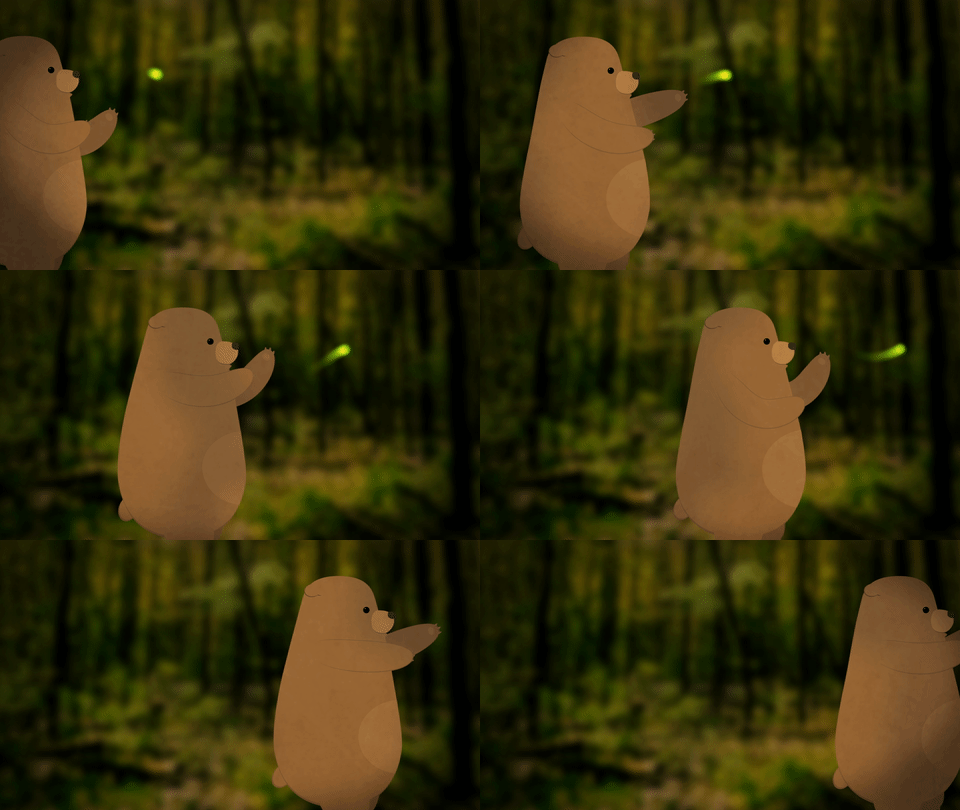
SQUASH AND STRETCH
For most character animation, I like to use the process of moving anchor points, parenting layers, and key-framing rotation that we went over in the last lesson. While this technique can achieve very sophisticated results, the animated characters can sometimes look a little stiff. When we watch a cartoon, we are accustomed to seeing things move in “elastic” way: stretching as they build up speed and squashing when they land. We can achieve this effect in After Effects using Puppet Pins.
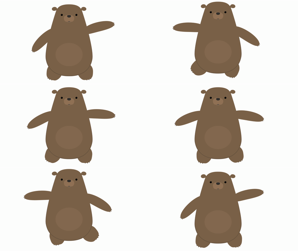
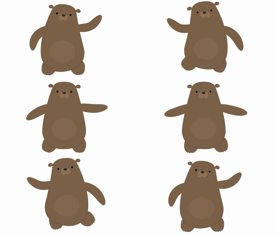
Pin It!
Set up your character in the same way we went over last time: position the anchor points on the joints, move the layers into position, and parent everything appropriately. Once everything is in place, it’s time to add some pins.
Puppet Pins are a tool for deforming layers. When you add pins to something in After Effects, the program generates a “mesh” over the object. When you move a pin, that mesh shifts and the layer is deformed. If you move a pin too much, you’ll get some funky results; the image will stretch too much and begin to tear. Moving a pin just a bit can give some really interesting results, though.
To start adding pins, select the Puppet Pins tool from the menu bar at the top of the screen – it’s the one that looks like a pushpin. In the timeline, select the layer you want to add pins to, then click on the layer in the composition panel to add a pin. You should see a yellow dot appear where you clicked.
Every pin you add will “pin down” a part of the object. That means that the more pins you add, the smaller the area that each pin will affect. My general rule is to add three pins to each part of the puppet I want to animate in this way. On an arm layer, I might add a pin near the shoulder, one near the elbow, and one near the wrist. On a leg layer, I might add one near the hip, one near the knee, and one near the ankle.
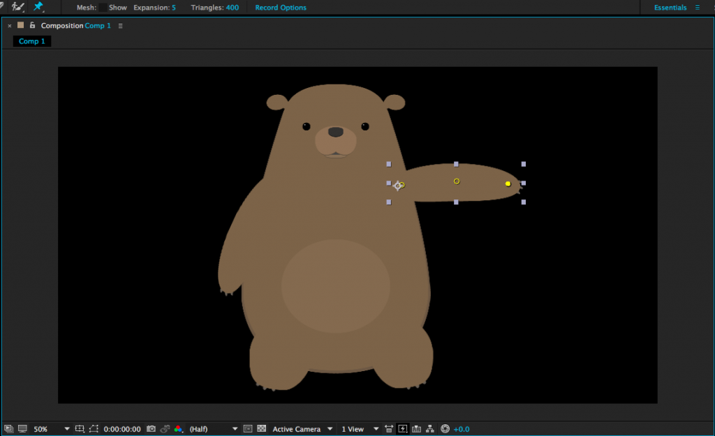
Pins have keyframes turned on by default, so you will add a keyframe every time you move a pin. However, you can still move or rotate the layer itself without adding pin keyframes. I like to add pin keyframes to accentuate movements; for example, I might add pins to a swinging arm to give the movement some elasticity. Note that pins are not affected by parenting layers to each other – they move independently. If you can’t see the pins, you can highlight the layer and click on the Puppet Pins tool again, or find the Puppet section of the layer in the timeline.
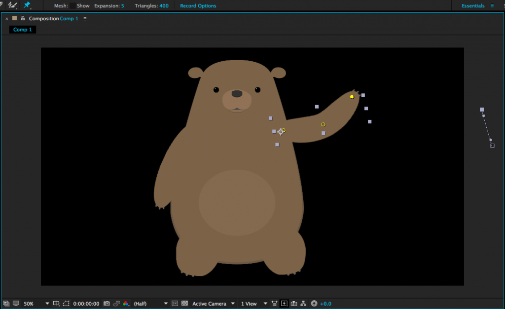
Occasionally, your pin may pull the layer apart in an unexpected way. This is usually because the mesh that the tool generates is not covering the entire object. When you have the Puppet Pins tool active, you should see some options next to the tool icon at the top of the screen. Clicking “Show” box next to “Mesh” will reveal the mesh that is being generated to deform the layer. If your mesh is cutting off part of the object, either add triangles or increase the “Expansion” property.
While Puppet Pins aren’t strictly necessary for character animation in After Effects, they do open up lots of new creative possibilities. Use them to make your animations seem even more alive!
