Categories
Weekly Lessons

Week 13: Expressions

EXPRESS YOURSELF

By now, you should be very comfortable keyframing properties in After Effects.  However, there is another way of animating in After Effects that doesn’t involve keyframes at all – using expressions.

Coding Animation

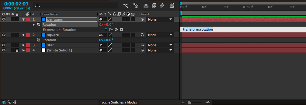
An expression is essentially a line of simple code that is applied to an animatable property.  It’s not the same as writing computer code – you don’t need to know any specific programming language, or anything like that – but the idea is similar.  To add an expression to a property, alt-click on the stopwatch icon that you usually use to turn keyframes on and off.  The value associated with that property will turn red and a box of text will open in the timeline window.  That window is where you add the expression.
screen-shot-2016-11-15-at-2-10-23-pm

Probably the simplest kind of expression – and one of the most useful – adopts the value of a property on another layer.  For example, you could take the rotation value of one shape and apply it to the rotation of another shape.  When you create an expression, four small icons will appear, one of which is the swirly “pick-whip” icon that we previously used to parent layers.  If you use the pick-whip to select the rotation property on a different layer and then hit “enter” on the keyboard, whatever value is entered for that layer will be used for the layer with the expression.
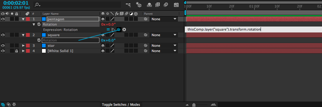
screen-shot-2016-11-15-at-2-17-33-pm

I realize that probably sound confusing, but it’s fairly simple in practice.  It means that you can animate a single layer and use it to affect other layers.  Simply animate the first layer, then use an expression on the others.  Try it out – once you get used to the process, you might find yourself using this particular expression a lot.

Incidentally, if you want to remove an expression, alt-click on the stopwatch icon again and it will return to normal.

giphy

Math

One thing that’s neat about expressions is that they can be easily combined or modified.  If, for example, you wanted to use the rotation expression above, but make the layer with the expression rotate the opposite way of the layer it gets linked to, that’s very simple.  Just use the pick-whip to select the layer with animation, then type *-1 (multiply by negative one) after the expression in the text box and hit “enter.”screen-shot-2016-11-15-at-2-38-05-pm

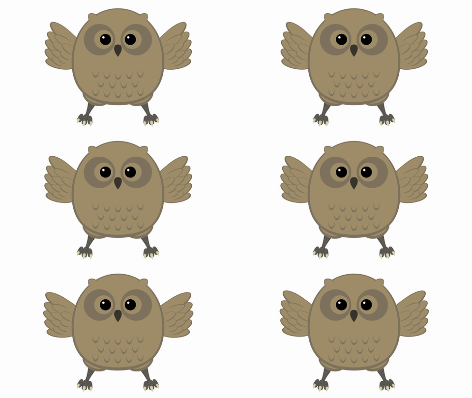
This technique can be very helpful for things like animating walk cycles (where both arms and legs will swing simultaneously, but in the opposite direction), or making a bird flap its wings.  You can animate both wings with one set of keyframes.  Furthermore, any changes you make to that set of keyframes will automatically affect both layers.
giphy-1

There are a lot more expressions that you can use to automate all sorts of properties in many different ways.  One that you might come across uses the timecode of the composition, often multiplied by a number.  If you add an expression to the rotation property of a layer and type time, the layer will rotate to one degree at the one second mark, two degrees at the two second mark, etc..  If you type time*100, it will rotate to 100 degrees at the one second mark, 200 degrees at the two second mark, etc..  This is a simple way to add continuous animation to a property, regardless of the length of the composition.

Get Random

I’ve been using rotation in my examples so far, because it’s an easy property to visualize.  Anything that can be keyframed can be affected by an expression, though – opacity, position, scale, and even the individual parameters of effects.  One of my favorite expressions, wiggle, applies random values within certain limits.   It can be used, among other things, to create unpredictable, organic-seeming movement when applied to the position of a layer.

To add wiggle to the position of a layer, alt-click on the Position keyframe icon in the Transform properties.  A text box will open in the timeline – in it, type wiggle, then two numbers in parentheses, separated by a comma.  For example: wiggle(2,150).  The first number in this expression is the frequency: 2 equates to two times per second.  Entering a 3 would be three times per second, and entering .5 would be half a time per second (or once every two seconds).  The second number is the amount to move.  So, our position expression “wiggle(2,150)” will move an object up to 150 pixels along the X and Y axis, twice per second.  If our layer were 3D, it would move on the Z axis as well.

screen-shot-2016-11-15-at-3-20-15-pm

Of course, you don’t always want random movement, but it’s occasionally extremely helpful.  I’ve used the wiggle expression to animate everything from fireflies to dials on a dashboard.  You can even apply a wiggle to a virtual camera to simulate the look of handheld footage.  Randomness is more powerful than you might initially realize.
giphy-2

Endless Possibilities

Expressions open up a vast new world of possibilities in After Effects.  The icon to the right of the pick-whip opens a window that contains dozens of “building blocks” – presets and pieces of expressions that can be combined to make very complex automated effects.  Don’t feel like you need to understand what each of these does – instead, just get comfortable applying expressions.  Often, online tutorials and trainings will provide expressions for you to copy and past into your own compositions.  Like so much of After Effects, once you are familiar with the process, you can figure out the specifics as you go.

giphy

Categories
Weekly Lessons

Week 12: Lights, Shadows, Action!

LIGHT AND DARK

Last week, we began exploring the wild, wonderful world of 3D in After Effects.  This week, we’ll take things a little further by incorporating virtual lights into our compositions.  This week’s lesson will really build on the previous one, so you may want to look things over again if you aren’t feeling confident.

Four Kinds of Light

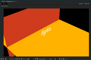
As we previously discussed, adding a virtual camera to a 3D scene in After Effects can give an entirely new dynamic quality to your compositions.  Virtual lights can have a similar effect.  The following simple scene is composed of four 3D layers: a red background “wall” layer, a yellow “floor” layer, a text layer, and a camera.  If you were to just glance at the composition, though, you wouldn’t know the scene was 3D at all – you have to switch to one of the “Custom Views” to see how things are arranged.

screen-shot-2016-11-08-at-2-39-44-pmscreen-shot-2016-11-08-at-2-40-04-pm

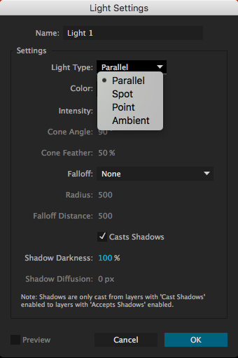
We can make this scene more interesting by adding lights.  Lights are created in the same way as virtual cameras and other kinds of layers: from the top menu, choose Layer>New> and then choose Light….  A menu will appear with several options, the most important of which is “Light Type.”  The kind of light you create will completely change how it affects the scene.  For each type of light, you can define the color and intensity.  Additional parameters will be available depending on which kind of light is selected.

screen-shot-2016-11-08-at-3-42-03-pm

screen-shot-2016-11-08-at-3-48-18-pm
Parallel Light

Parallel:  These are rays of light cast in a certain direction.  Parallel lights behave similarly to outdoor sunlight and can cast shadows.  By default, parallel lights do not “fall off”, so it does not matter how close or far they are from the things they illuminate.  Changing the Point of Interest on a parallel light will change the direction it casts light in.


screen-shot-2016-11-09-at-1-35-28-pm
Spot Light

Spot:  This is a cone of light that is brightest in the center, then fades to darkness.  You can adjust the angle and “feather” of the cone and spot lights can cast shadows.  Spot lights have the most potential parameters to adjust – in addition to the light’s position, you can change its point of interest, orientation, and rotation on the X, Y, and Z axis.


screen-shot-2016-11-09-at-1-42-22-pm
Point Light

Point:  This is light emanating in all directions from a point in space.  Like all light types, the point light itself is invisible – there is no glowing orb where the light is located, only its effects are visible.  Point lights can cast shadows and are brightest close to the location of the light.


screen-shot-2016-11-09-at-1-48-06-pm
Ambient Light

Ambient:  This is light emanating from everywhere at equal intensity.  Because light is coming from all directions, ambient lights cannot be used to cast shadows.  Ambient lights are helpful when used in addition to other types of light, since they can change the illumination level and color of a composition uniformly.

Casting Shadows and Material Options

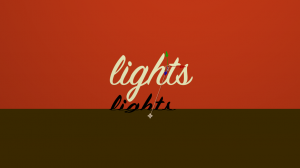
When you create a new parallel, spot, or point light, you will have the option to check a box that says “Casts Shadows.”  However, you will also need to tell After Effects which layers in the composition are affected by the light’s ability to cast shadows.  By default, every 3D layer can receive shadows (a shadow will show up on that layer when it is cast by another layer) but not cast shadows.

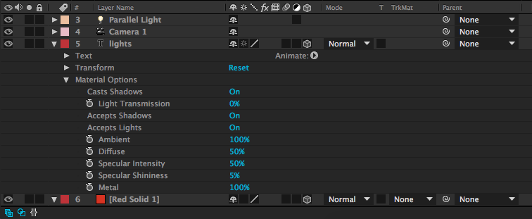
To change this and make your layers actually cast shadows, you’ll need to look at the “Material Options” for the layer.  These are found below the “Transform” properties in the timeline window.  The first option is “Casts Shadows.”  In the same category are options for “Accepts Shadows” and “Accepts Lights,” both of which are “On” by default and both of which you can probably leave that way – unless you specifically want a layer to not be affected by the lights in your scene.

screen-shot-2016-11-09-at-2-05-18-pm

There are other areas you can adjust in the Material Options – shininess, diffusion, and more.  While these parameters can be fun to play with, don’t be surprised if they don’t make a dramatic difference; many of these properties (like “Specular Intensity”) are most apparent on curved surfaces – and 3D layers in After Effects are flat.  I generally don’t do much with the Material Options besides enable or disable shadows.

Illuminate Things!

Now that you know what the different kinds of lights can do, use them creatively to add an extra layer of interest to your compositions.  Remember that almost every parameter – color, intensity, position, point of interest, etc. – can be keyframed.  Also remember that lights, like cameras, only affect 3D layers in After Effects; nothing will show up until you click on that little 3D box icon for the layer in the timeline window.  Have fun!

lights-giphy

Categories
Weekly Lessons

Final Project Details

I’M GLAD I SPENT IT WITH YOU

We’ve covered a lot of ground this semester and – while we still have plenty to explore – we’re entering the final stretch.  Believe it or not, it’s time to start thinking about the final project.  You all submitted some great ideas for the project and I’ve tried to incorporate as much of your feedback as possible into the assignment.  The instructions are pretty simple:

  • Your final project must be a video between one and two minutes in length.
  • You must use both After Effects and Premiere Pro to create your project.
  • You may not use copyrighted materials, but royalty-free music, clips, and imagery is fine.
  • Your project must be based on the following theme:  It’s Such A Perfect Day.

If you aren’t aware, the theme is a line from the Lou Reed song “Perfect Day.”  I chose this theme for a few reasons.  First, it’s a completely subjective notion that can be interpreted ironically, earnestly, sarcastically, or somewhere in between.  I also think it leaves the project open for many different approaches – animation, found footage, live action, compositing, or a combination thereof.  Plus, it’s just a great song.

You can approach this theme however you like.  What’s your perfect day?  Is such a thing possible?  How does this notion mesh with the current political/environmental/cultural climate?

The one thing you can’t do is to use the song in your video – remember, no copyrighted media.  Instead, use it as a jumping-off point and get as creative as you like!

Here is the schedule for the final projects:

11/3 – Review the project details.

11/10 – Come to class prepared to discuss your plan for the project.

11/17 – Work-in-progress drafts due – review and provide feedback in class.

12/1 – Final drafts due – review and discuss in class.

All finished projects will be submitted for possible inclusion at the end-of-semester screening at the Campus Theatre.  Good luck, have fun, and don’t hesitate to contact me if you have questions or need assistance!

Categories
Weekly Lessons

Week 11: The Third Dimension

INTO THE Z-AXIS

So far, we’ve used After Effects for 2D design, effects, and animation work.  After Effects can also be used for 3D work – although there are some caveats.  After Effects is not designed to do 3D graphics work in the same way that programs like Maya, Cinema4D, and Blender are.  You can’t create detailed 3D models or complex environments in After Effects.  However, you can move 2D assets into the third dimension – and create some unique and dynamic results.

From 2D to 3D

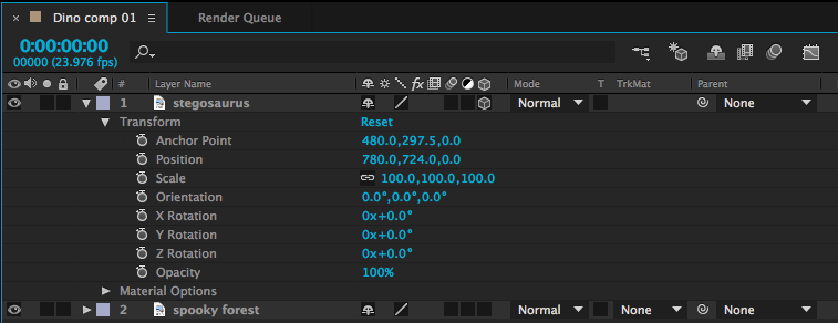
You may have noticed a series of symbols at the top of the timeline window, next to the Layer Name column.  If you can’t see them, toggle the view options at the bottom-left of the timeline window.  These symbols represent different properties that can be turned on or off for each layer.  Depending on the kind of media each layer is, you may or may not have a check box for each symbol.  For example, the symbol that looks like a strip of film toggles frame interpolation, which is only applicable to video layers.  The box we want to use looks like a little wireframe cube.  This switches layers from 2D to 3D.

screen-shot-2016-11-02-at-2-35-24-pm

Clicking on this box will probably not make an immediate change to the way your composition looks.  However, if you look at the Transform options for that layer in the timeline, you’ll see that the possibilities have expanded greatly.

screen-shot-2016-11-02-at-2-35-57-pm

Position, for example, was formerly defined by two numbers – a value on the X (horizontal) and Y (vertical) axis.  In other words, that layer could formerly move up-and-down and side-to-side.  With the 3D box checked, a third number has been added – we can now move forwards and backwards on the Z (depth) axis.  The anchor point value has also gone from two variables to three.  Rotation was previously described by a single number, but now objects can be rotated three ways.  There is also a new “Orientation” value, which provides another set of rotation values.  Scale has gained a third number as well, although the new Z-scale value won’t generally affect 2D layers.

3D Rotation

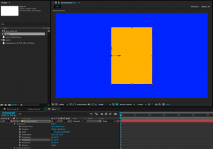
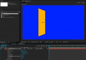
Let’s look at the rotation values first.  X Rotation spins an object around a horizontal axis, Y Rotation spins around the vertical axis, and Z Rotation spins around the depth axis (2D layers can only spin around the Z axis, so X and Y are the new options).  The best way to understand how these work is just to take some time playing with the values.  Remember that layers rotate around their anchor points.  So, if you want an object to swing open like a door, you’ll need to move the anchor point to the side of the object and keyframe the Y Rotation.  If you don’t change the anchor point, the object will spin around its own midpoint.

screen-shot-2016-11-02-at-3-02-15-pmscreen-shot-2016-11-02-at-3-02-46-pm

X, Y, and Z Rotation each have their own section under the Transform properties.  The Orientation section combines all three into a single keyframe-able value with three numbers.  I tend to use the individual Rotation values more than Orientation, but they both do the same thing.

It is possible to work with both 2D and 3D layers in the same composition, but they don’t really “interact” with each other.  If you rotate a 3D object so that it intersects with another 3D object, one will be “clipped” by the other.  A 2D object will simply float in front of or behind a 3D object, depending on its layer position in the timeline.

3D Position

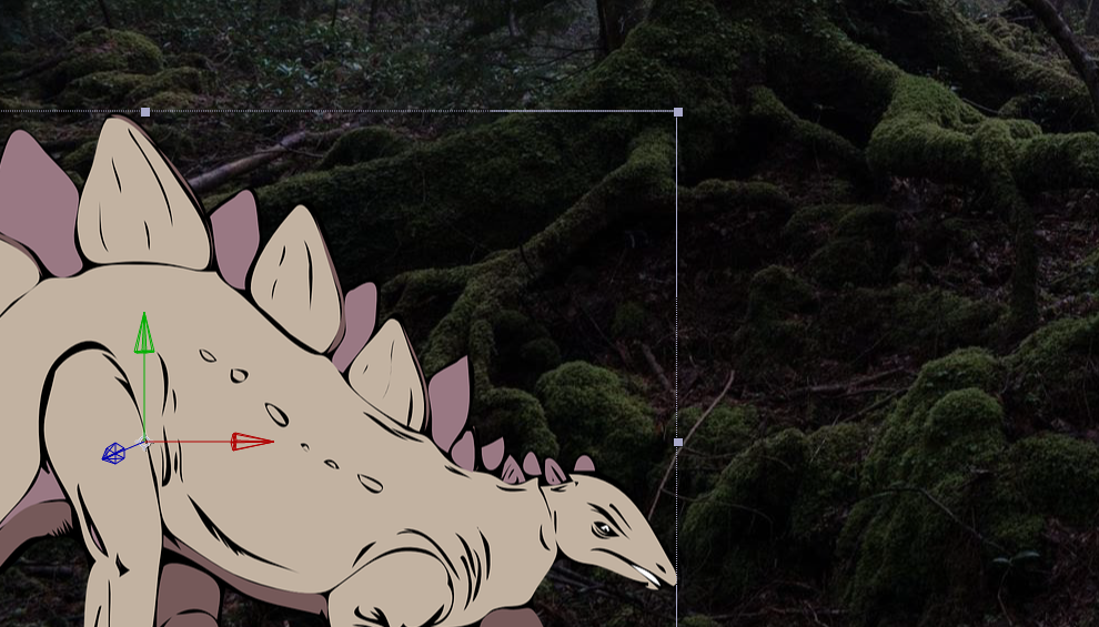
When you click on a 3D layer, you will probably notice a new icon appear in the composition window.  This icon is comprised of a green, red, and blue arrow, centered on the anchor point of the layer.  You can click and drag on the green, red, and blue arrows to move an object along the X, Y, and Z axis, respectively.  You can also change these values using the three numbers that now appear next to “Position” in the layer’s transform properties in the timeline window.

screen-shot-2016-11-02-at-3-23-44-pm

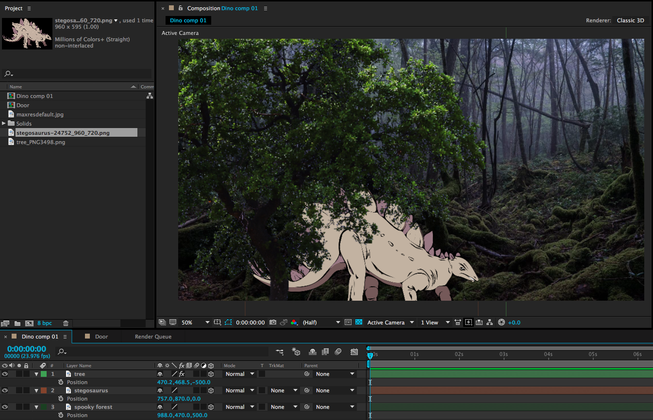
Entering a positive value for the Z position (the third number) will push the layer further away; entering a negative value will pull the layer forward in 3D space.  This may be somewhat counter-intuitive, so take some time to familiarize yourself with it.  To create a very simple 3D scene, you might enter a positive Z position value for the background layer, a negative Z position value for the foreground layer, and 0.0 for the Z position value of the middle layer.  As these layers get moved along the Z axis, their size will appear to change.  You can compensate for this by adjusting the scale.

screen-shot-2016-11-02-at-3-38-46-pm

This can give us a nicely layered composition, but so far, we haven’t done anything we couldn’t do by adjusting the scale and position of 2D layers.  For example, you can make an object appear to move closer by increasing its scale.  So why use 3D position?  One reason is that it can be difficult to estimate the way that scale and position should correspond.  The other reason has to do with perspective and an effect that we can achieve only by using 3D layers – but for that technique, we’ll need a virtual camera.

A Virtual 3D Space

In our 2D work, we used the After Effects composition window sort of like a collage board; flat layers were placed on top of each other, rearranged, and adjusted.  When we switch layers from 2D to 3D, that collage board becomes more like a shadow box; objects can move forward and backward in space.  Our perspective on the shadow box hasn’t really changed, though – our view is fixed.  By adding a camera to the scene, we can change our perspective and even move into the scene itself, going from a shadow box to a complete virtual environment.

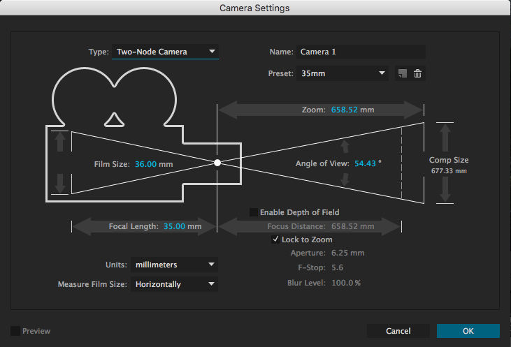
To create a camera, go the the Layer dropdown menu at the top of the screen and choose New>Camera….  This will bring up a dialog box with lots of options.  You can dig into these values and customize your virtual camera as much as you like, but I’d recommend leaving most settings at their defaults, at least to get started.  The one thing you may want to adjust is the Preset, which has a handful of simulated lens options.  These act just like lenses on real cameras: wider lenses (lower numbers) have a larger field of view and Z axis movement will be exaggerated.  Longer lenses (higher numbers) have a narrower field of view and Z axis movement will be compressed.  If you aren’t sure what to use, either the 35mm or 50mm presets are generally safe, middle-of-the-road options.

screen-shot-2016-11-02-at-4-07-43-pm

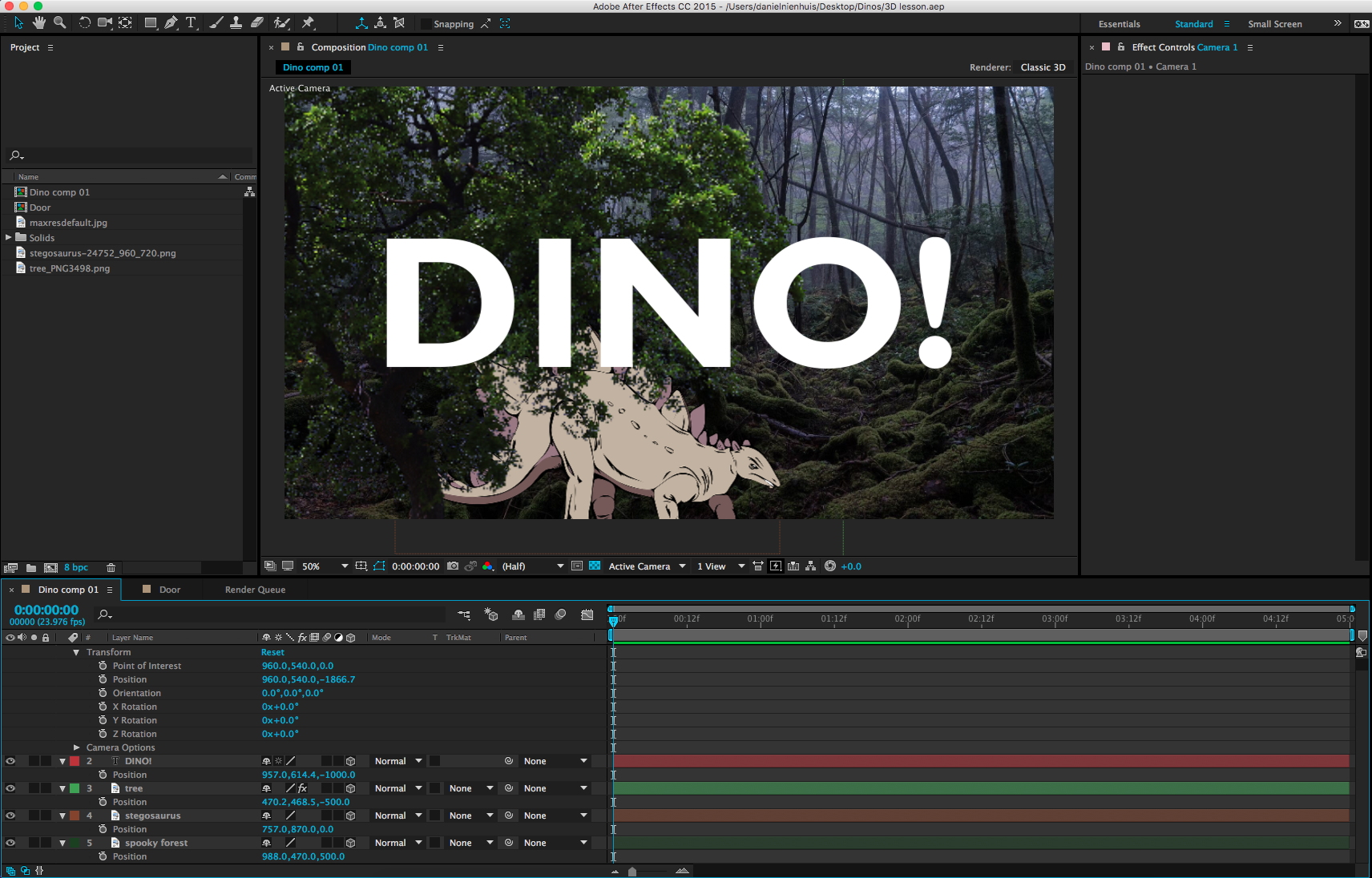
After you create your camera, you may notice an immediate difference in the scale of the objects in your composition.  This is because of the aforementioned properties of the lens on your virtual camera.  If you tip down the triangle next to the name of your camera layer in the timeline, you will see Transform properties and Camera Options.  The Camera Options section contains a ton of variables to play with – you can define the virtual depth-of-field, the shape of the simulated iris, the size of the aperture, and much more.  We can’t get into all the variables in this lesson – and, honestly, I rarely make many changes to this section.  Turning Depth of Field “on” can give some really interesting results, but you can also simulate that effect by adding blur to the layers.  If you want to explore these options on your own, feel free!

The Transform options control camera movement.  You can keyframe the rotation along all three axis, either individually or using the Orientation.  The position works the same as other 3D layers, but there is also a keyframe-able Point of Interest property.  This is the point that the camera is aimed at; so, for example, if you keyframe the camera’s position along the X axis, but don’t adjust the Point of Interest, the camera will move from one side to the other while remaining aimed at the center of the screen.  You can get some cool results this way, so take some time to play around.

screen-shot-2016-11-02-at-4-34-22-pm

In addition to the control options in the timeline window, you can adjust your camera using a section of tools in the toolbar at the top of the screen.  The default option is the “Unified Camera Tool” (which looks vaguely like a movie camera), but there are several to try out if you prefer more “hands-on” control.

screen-shot-2016-11-02-at-4-41-02-pm

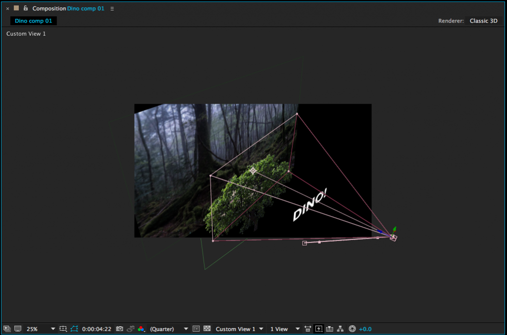
If you’re having a hard time visualizing how exactly your camera is moving, it can be helpful to change the view setting of your composition window.  At the bottom of the window is a dropdown menu that, by default, reads “Active Camera.”  Clicking this will give you different options for viewing your composition in 3D space.  In particular, Custom Views 1, 2, and 3 are helpful for seeing how your camera is positioned and where it is pointed.  Note that you may need to toggle the background visibility on or off (the checkerboard icon next to the view setting) and/or zoom out your view to see what’s going on clearly.  Just switch back to “Active Camera” when you’re done.

screen-shot-2016-11-02-at-4-47-51-pm

There are many more things to explore when it comes to 3D work in After Effects.  You can create different kinds of virtual lights, control the way simulated shadows are cast, affect how shiny or matte objects are, and so on.  For now, though, just get used to moving objects in 3D space and operating a virtual camera – it will open up a whole new world of creative possibilities.

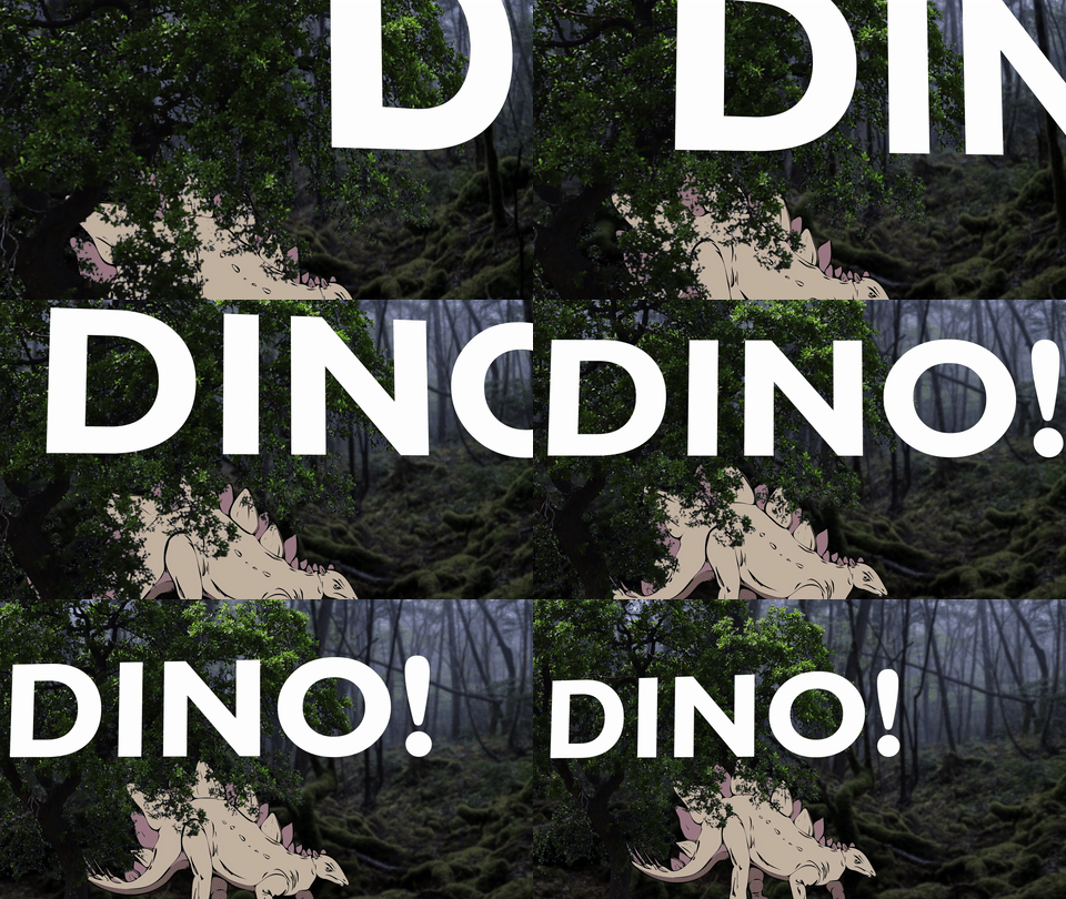
dinogif

Project 9: Hidden Depth

This week, I’d like you to create a 3D scene with a moving virtual camera.  The scene only needs to be between five and ten seconds in length.  You can use any media you like for this project, but if you want something to get started with, you can download the images at this link.  It’s full of dinosaurs!

This is a whole new world of options in After Effects, so don’t get too bogged down with doing something really elaborate.  Just play with the settings and see what you can do!  Make your composition resolution 1920 x 1080 and render it as a QuickTime movie using the H.264 preset.  As usual, upload the file and send me the download link.  Good luck!

jurassic_world_rexy_png_by_manusaurio-d9egxy7

Categories
Weekly Lessons

Week 10: Revenge of the Green Screen

GETTING SERIOUS ABOUT CHROMA

We’ve gone over green/blue screen compositing (or “keying”) in Premiere already, so you should have a pretty solid understanding of the process.  While Premiere does a very capable job of keying footage, After Effects has more advanced compositing tools and offers finer control.  When I have to put together a green screen shot that is especially complicated or use footage that is challenging I almost always use After Effects.

Masking and Keylight

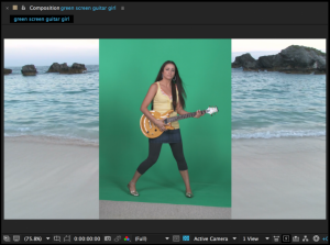
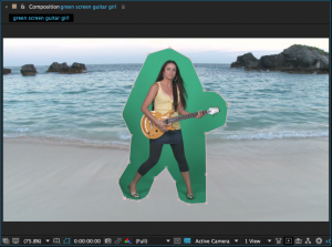
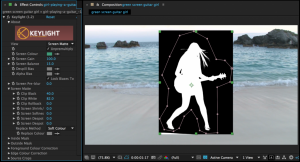
In Premiere, we used the crop effect to quickly mask out unwanted areas of green screen footage.  In After Effects, we can use the mask tool to do the same thing, but with much greater control.  Use the pen tool to draw a rough mask around your subject, cutting out any unwanted areas of the frame.  The more you can cut out, the less the program needs to color-key, and the better your results are likely to be.

screen-shot-2016-04-26-at-11-11-07-am-768x572screen-shot-2016-04-26-at-11-08-37-am-768x571

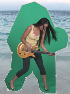
screen-shot-2016-04-26-at-11-15-23-am-768x573While you want to crop out as much as you can, if you draw your mask too close to the subject being keyed, they may move outside the mask during the clip.  If this happens, the subject will be partly cut off.  To avoid this, you can animate the shape of the mask.  Under the mask properties in the timeline panel you will find “Mask Path.”  If you turn keyframes on for this property, you can animate the shape of the mask by dragging its points.  Simply go through the footage and change the shape of the mask whenever your subject moves out of it.  You may need to shift-click on a mask’s points to select it individually.  Once the shape of your mask has been keyframed, it should move around your subject throughout the footage without cutting them off.  You can also add a slight feather to the edges of the mask, to help everything blend together.
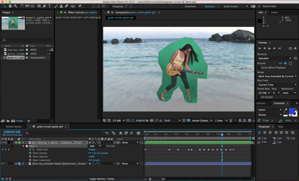
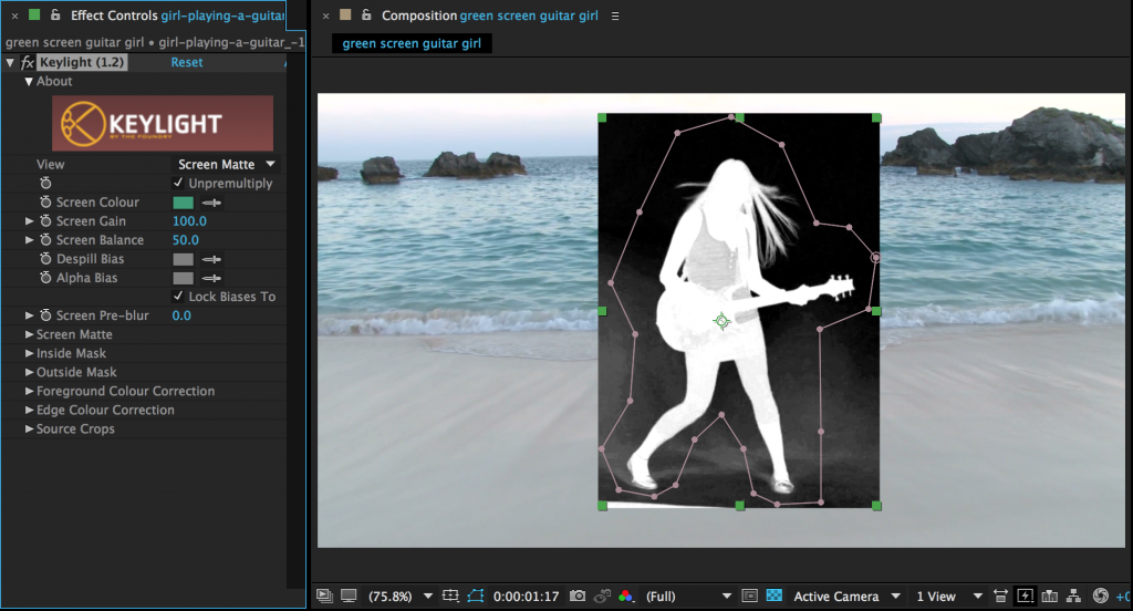
screen-shot-2016-04-26-at-11-26-54-am-1024x622

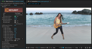
Once you’ve isolated your subject with a mask (and animated it, if necessary), you can begin to actually key the footage.  There are lots of compositing options available in the “keying” section of the effects, but your best bet is an effect called Keylight.  Keylight is similar to the UltraKey effect in Premiere in many ways.  First, select the color of the mask using the eyedropper tool – you should see an immediate effect.  Next, change your view mode from “Final Result” to “Screen Matte.”  This will give you a black-and-white view of the areas being keyed out – black areas will be taken out, white areas will remain, and anything grey will be transparent.  Your goal is to get rid of all the grey areas.

screen-shot-2016-04-26-at-11-42-08-am-1024x552

The first effect parameters you should adjust are the “Screen Gain” and “Screen Balance.”  Try adjusting each to see if the result improves or gets worse, but don’t worry if you can’t get it exactly right – this is only the first step.  Be careful not to lose detail as you adjust the gain and balance.  Next, move down to the section of the effect called “Screen Matte.”  The two things you want to adjust here are “Clip Black” and “Clip White.”  As you turn “Clip Black” up, the dark areas of the screen will get darker.  As you turn “Clip White” down, the light areas of the screen will get whiter.  You should be able to get your image to only black and white using these parameters.  Be careful not to adjust any one thing more than you need to – again, going too far will cause you to lose detail.  If you can’t get rid of some of the grey, you may need to add a color correction effect to the media before you try to key it.

screen-shot-2016-04-27-at-2-02-07-pm-1024x553screen-shot-2016-04-27-at-2-33-57-pm-1024x554

Once everything looks good, switch your view back to “Final Result.”  To fine-tune the final image, you can adjust the “Screen Shrink/Grow” and “Screen Softness.”  If you set the “Screen Shrink/Grow” to a negative number, it will bring in the keyed edge.   “Screen Softness” will soften the edge.

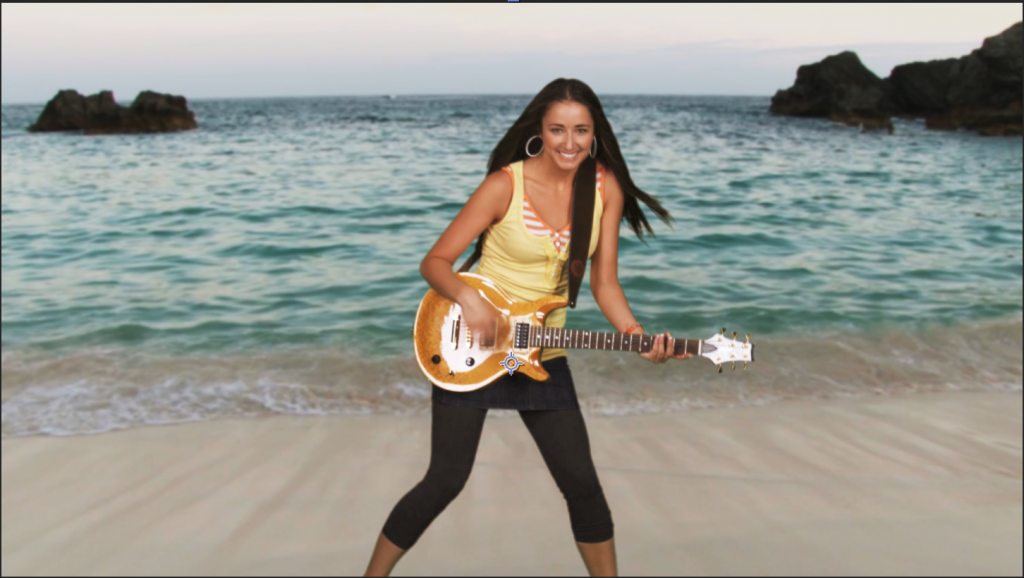
With the key done, you can add color correction effects, blurs, adjustment layers, and transform properties to meld the green screen footage and the background together.  Remember to pay attention to perspective and that adding a slight blur to the background can help it look more natural.

screen-shot-2016-04-27-at-3-27-31-pm

Advanced Presets

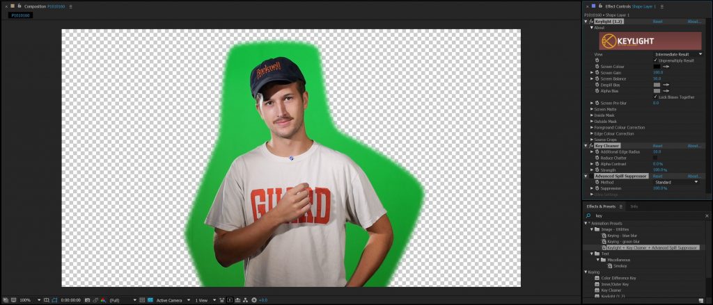
The technique outlined above should generally give better results than we were able to achieve using Premiere Pro’s  built-in chroma key functionality.  However, you still may have trouble pulling a completely clean key all the time – green screen compositing can be challenging even when using advanced software like After Effects.  The most common areas of trouble are “chatter” in the keyed image, fringing around the edges, and unwanted color casts.  To fight these, After Effects includes a set of effect presets that work in conjunction: Keylight, Key Cleaner, and Advanced Spill Suppressor.

capture1

Begin by using the same masking technique as before, cropping around your subject and animating the mask as necessary to account for movement within the frame.  When you are ready to add the Keylight effect, however, don’t choose it from the Effects drop-down menu; instead, type “key” into the Effects search bar.  In addition to the standalone Keylight effect, you should see “Keylight + Key Cleaner + Advanced Spill Suppressor” listed under “Animation Presets.”  Drag this preset onto your footage.

capture2

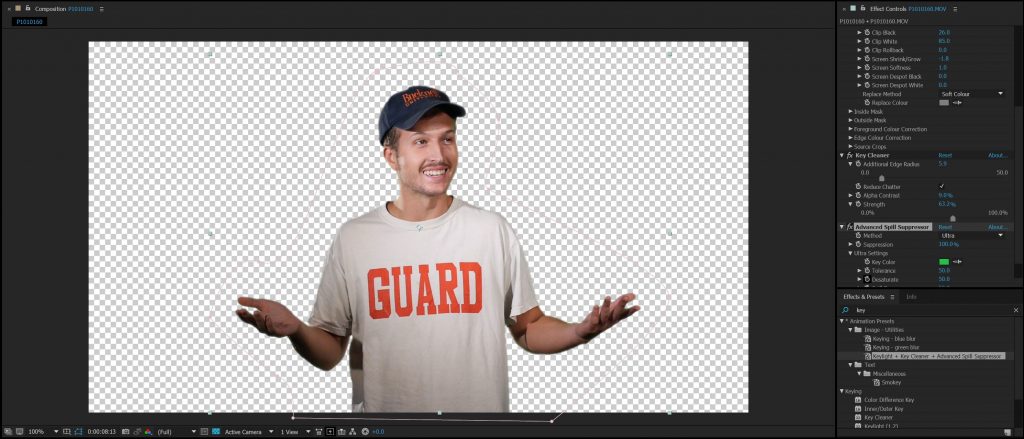
You should now have three effects added to the layer, although the visibility of the Advanced Spill Suppressor is turned off initially.  If you look closely at the settings of the Keylight effect, you’ll also notice that the view is set to “Intermediate Result” instead of “Final Result.”  This is because of the way the three effects work together.

Keylight is the first of the three effects you should make changes to and the process is basically the same.  Switch the view to Screen Matte, make tweaks to the Screen Gain and Screen Balance, then clean up the problem areas using Clip Black and Clip White.  Flip the view back to Intermediate Result (not Final Result) and make any necessary adjustments to Screen Shrink/Grow and Screen Softness to clean up the edges of the key.  However, don’t worry about it too much if there is still some colored fringe on the edges – the other two effects will help with that.

The Key Cleaner will do two things: help refine the edge of your key and reduce “chatter.”  Chatter is the noise pattern that sometimes appears in keyed footage, often in dark areas.  To remove it, simply click the “Reduce Chatter” check box.  The other parameters in Key Cleaner affect the key’s edges; try sliding them back and forth and see what the results are.  I tend to leave the settings fairly close to the defaults, only making slight tweaks.

You may still have some faint green fringing on your key.  To remove this, turn on the Advanced Spill Suppressor by clicking the blank box next to its name in the Effect Controls panel.  Remember that “on” effects have an “fx” icon next to them.  The standard settings for Advanced Spill Suppressor are incredibly simple: once the effect is turned on, you should see an immediate effect.  If too much green is being taken out of the image, turn down the “Suppression” setting.  Most of the time, that’s all that you need to do.  If you aren’t getting the result you want, you can switch the method from the standard settings to “Ultra.”  This will give you a handful of parameters to adjust and play with.  If you still aren’t getting a clean key, you may need to refine something earlier in the process, such as the animated matte or the parameters in Keylight.

capture3

You should be able to get a clean key on just about any reasonably well-shot green screen footage using this method.  Once you have your footage keyed out, you can get creative with compositing and color grading.  One trick that I sometimes use is to duplicate the background layer and place it over the keyed subject.  You can then blur it way out and lower the opacity down to maybe 10 or 15%.  This will give a faint color cast to the subject and help them seem like part of the background environment.  This trick isn’t always appropriate, but it is often useful.

capture4

Project 8: Make It Spooky

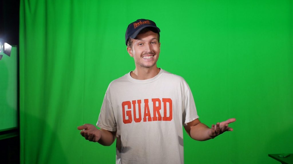
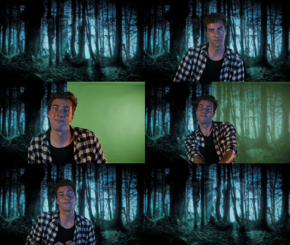
Remember the green screen footage we shot way back in Week 5?  It gave us problems in Premiere Pro, but I’m confident that the tools in After Effects are more than enough to handle it.  Choose one (or more, if you feel up to it) of the clips in this folder to composite using one of the methods described above.  You may be able to key the footage using only Keylight, or you may need to use the preset trio of keying effects.  Experiment and see what works.

Since this is the last class before Halloween, I want you to create a spooky scene from the composited footage.  You could use a dark cemetery background or an abandoned asylum.  You could make your shot look all grainy and found-footage-style or you could go for classic Hollywood horror in black and white.  It’s up to you.

This assignment has two goals.  The first is to get a really good, clean key from the footage.  The second is to make your compositing and color work cohesive and atmospheric.  Remember to use adjustment layers and color grading to tie everything together.  If you aren’t happy with the color correction tools in After Effects, feel free to export your video and make final adjustments in Premiere.  Upload the footage and send me the finished result.  Have fun and make it spooky!

giphy