Categories
Weekly Lessons

Week 9: Character Animation

GIVING CHARACTERS LIFE

So far, we’ve used After Effects to create dynamic title graphics and lower thirds.  Now it’s time to push the program even further and try some character animation.  This kind of work can be time-consuming, but it’s incredibly fun and rewarding to see static characters suddenly come to life.

Pre-composing and Adjustment Layers

We’ve discussed nesting and adjustment layers in Premiere already; After Effects has some very similar features.  Adjustment layers are basically identical in both programs.  To create one, go the the Layer drop-down menu at the top of the page and go to New>Adjustment Layer.   An adjustment layer the size of your current composition will be created and placed in the timeline.  As in Premiere, any effects you apply to the adjustment layer will affect the layers below it.  However, After Effects also lets you modify adjustment layers in interesting ways by using the Transform controls and masks.  For example, you can use a circular subtract mask on an adjustment layer to create a simple vignette.

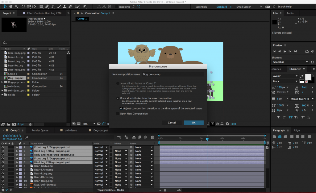
Pre-composing layers is the After Effects equivalent of nesting.  To pre-compose media in the timeline, select the desired layers (command-click to choose more than one layer), right-click and select Pre-Compose….  A menu will appear with options for re-naming the new composition (probably a good idea), leaving or moving the “attributes” of the layers (choose to move them), adjusting the length of the new composition (choose to do this), and opening the new composition (not necessary).
screen-shot-2016-04-05-at-11-06-36-am-1024x624

Once the layers have been pre-composed, the new composition will appear in the old composition as a single layer.  It will also show up as a new composition in the list of project media.  If you double-click on the pre-composition, it will open up in the timeline and preview windows.  Pre-composing media is a great way to clean up a chaotic composition (sometimes you just have way too many layers in there), as well as a simple method of applying effects and transformations to multiple layers at once.

Parenting

Parenting is a unique feature in After Effects and it’s incredibly powerful.  When you parent one layer to another, the “child” layer will be affected by the scale, position, and rotation of the “parent” layer.  Parenting does not affect opacity, effects, or masks.

To parent a layer, you use the Parent section of the composition panel.  You can either choose the parent layer from the drop-down menu or use the “pick whip” selector next to it (it looks like a little swirl).  A parent layer can have multiple child layers connected to it – and a child layer can have its own child layers – but a child layer cannot have multiple parent layers.  That probably sounds confusing, but it should quickly make sense once you start playing with it.

Parenting has some very basic and commonplace applications for things like lower thirds and title design.  For example, you could parent a text layer to a solid layer, then animate the solid layer sliding into the frame.  The text will keep its position relative to the solid and slide in with it.  This keeps your animation consistent and means that you only need to keyframe properties on one layer instead of two.

Under the Layer drop-down menu, you can also create a “Null” object (Layer>New>Null Object).  Null objects don’t appear to do anything at first, but they are very useful as parent layers.  You can parent several child layers to a null and then affect them all simultaneously.

Animation

Parenting layers together also allows you to do fairly complex character animation in After Effects.  To do this, you’ll probably want to use files that have the “puppet” character separated into multiple layers.  A simple puppet might have the figure’s arms, legs, head, and body on different layers.  Complex puppets will break down the figure more and more – you might have separate layers for parts of the face, finger segments, clothing, and more.  Basically, any part of the figure that you want to animate should be on its own layer.

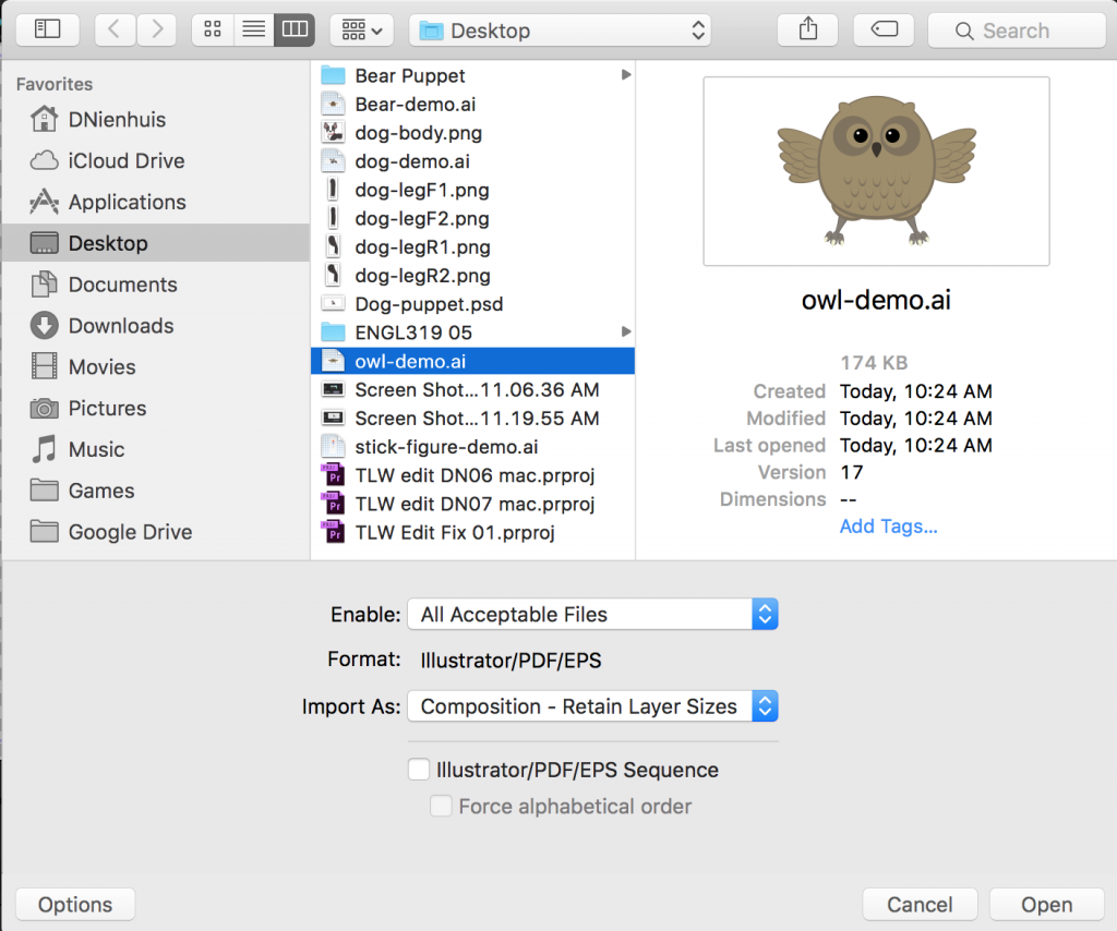
You can import these layers individually, but After Effects is also very good at playing with files created in other Adobe programs.  If you create your puppet in Photoshop or Illustrator, you can import those files with their layer structure intact.  When you import an Illustrator or Photoshop file, simply change the Import As drop-down from “Footage” to “Composition – Retain Layer Sizes.”  (The “Composition” option will work also, but I find “Retain Layer Sizes” easier to work with.)  If you’re using a Photoshop file, another screen may appear with the option to keep or merge your layer styles – I tend to choose “merge.”  Once you’ve imported the file, it will appear as its own composition with each layer separated out.  Note that you will only get the dialog box with these import options if you use command I or File>Import – if you just drag an Illustrator or Photoshop file into the project window, all the layers will be combined into one piece of media.
screen-shot-2016-04-05-at-12-06-46-pm-1024x854

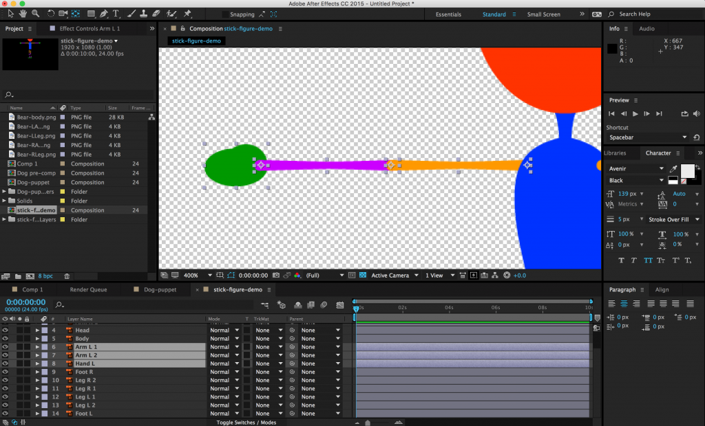
With the puppet imported, you’ll want to begin parenting the different parts together – but first, you should think about each layer’s anchor point.  As we discussed previously, a layer’s anchor point is the point around which the layer scales and rotates.  Since we’ll be doing most of our animation using the rotation property, the anchor point is important.  For example, a hand rotates around the wrist, the forearm rotates around the elbow, and the upper arm rotates around the shoulder.  You can use the “pan behind” tool (its icon has four directional arrows in a dashed box – the shortcut is Y) to grab and move anchor points to their appropriate locations.
screen-shot-2016-04-05-at-12-23-43-pm-1-1024x620

You can then parent the layers accordingly – in this example, the hand is parented to the forearm, the forearm is parented to the upper arm, and the upper arm is parented to the torso.  If you do this correctly, rotating the forearm will also move the hand and rotating the upper arm will move all three.  I realize that this is probably difficult to visualize, so take some time to play with parenting and anchor points.  Imagine your puppet is a marionette and think about where the hinges should be – that’s where your anchor points go.  Once the anchor points have been set and the layers have been parented, you can begin animating the puppet by rotating and moving the layers.  Don’t forget to turn keyframes on for any properties you want to animate!

screen-shot-2016-04-05-at-8-38-43-pm-1024x250

Project 7: It’s Alive!

This week, you’ll be doing some simple character animation.  Download the media at this link.  Inside, you’ll find files for a few different puppets – there are some Illustrator .ai files, a photoshop .psd, and some individual layers.

  • Create an animation of at least 10 seconds, using two or more of the puppets in the folder.
  • There are no background images in the folder, so either create one, download one, or use media from a previous project.
  • It’s not required, but feel free to add music or sound effects for extra points.

Render the finished animation and send me the download link.  Animation can be a very time-consuming process, so don’t feel like you need to get too elaborate.  That being said, get as creative as you like – if you want to modify the puppets or create your own, do it!

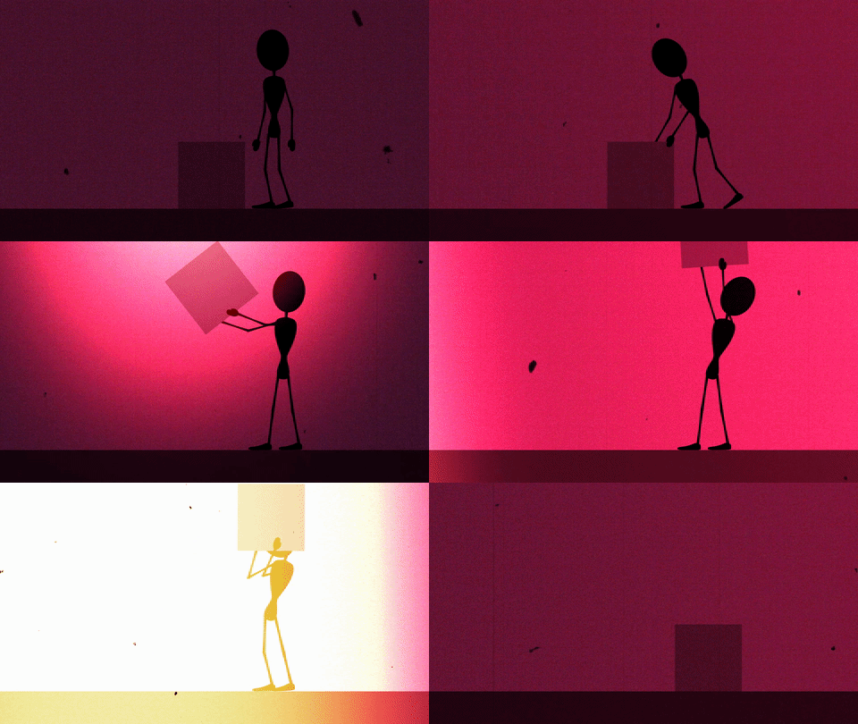
doggiphyowlgiphyboxgiphy

Categories
Weekly Lessons

Week 8: Digging Into After Effects

ESSENTIALS 2.0

There are a few more key techniques that we need to cover in the After Effects workflow.  Hopefully, you are starting to see what the program can do and how it works.  If you find yourself getting tripped up, it may be helpful to review the Week 7 blog post on After Effects basics.

Manipulating Layers

One very basic action that we haven’t covered yet is the editing of a layer’s in and out-points.  By default, the entire length of a piece of media is dragged down into a composition and you may have noticed that there is no razor blade tool in the After Effects toolbar.  Instead, to trim the beginning of a layer, move the playhead to the desired in-point and hit option [.  Option ] will set the end point.   (Use alt on a PC.)  You can also click and drag on the ends of layers in a composition.

If you don’t hold down option, the [ and ] keys will move the layer without trimming it.  [ will move a layer so that its in-point is at the playhead location.  ] will move a layer so that it’s out-point is at the playhead.  These shortcuts allow you to adjust the length and position of layers in the timeline very quickly, once you’re accustomed to using them.

When you’re moving or trimming layers, it’s obviously important to have your playhead exactly where you want it in the timeline.  You can use the spacebar to play or move the playhead by clicking and dragging it with the mouse.  For precision, you can use page up and page down to move frame-by-frame forwards and backwards.  This is different from Premiere, which utilizes the arrow keys to move the playhead; in After Effects, the arrow keys adjust the position of the highlighted layer.  If you hold shift and press page up or page down, you will move the playhead ten frames instead of one.

You will also probably need to duplicate layers fairly often in After Effects.  This can be done by copy/pasting, but you can also use the command D keyboard shortcut.  You can actually use command D to duplicate all sorts of things in After Effects: shapes, text, entire compositions, and even effects.

One last note about layers: if you double click on a layer in the timeline, it will open that layer in a panel over the composition preview window.  This is actually not where you usually want to work, so if you accidentally double click on something, close the layer panel or click back to the composition preview window.

Easing Keyframes

The ability to keyframe and animate properties is probably After Effects’ most powerful feature; however, that animation may look a little stiff and unnatural at first.  For example, if you use two “normal” keyframes to move a shape across a composition, the shape will begin moving abruptly, travel at a constant speed, and then stop abruptly.  Sometimes, this is the desired effect, but it’s not how things usually move in the real world.  Fortunately, After Effects makes it simple to make animation more natural and dynamic.

screen-shot-2016-03-30-at-3-40-28-pm-1024x213

By default, keyframes in the timeline are diamond-shaped.  This is a standard “linear” keyframe.  If you right-click on a keyframe and move down to the “Keyframe Assistant,” you’ll see three “Easy Ease” options: Easy Ease, Easy Ease In, and Easy Ease Out.  Easy Ease Out “eases out” a property, meaning it will start slowly and then build up speed.  Easy Ease In “eases in” a property, meaning it starts fast and then slows down.  Easy Ease is used for keyframes where you want a property to start fast, slow down, then pick up speed again.  When you choose one of these options, the shape of the keyframe will change: Easy Ease Out is an arrow pointing left, Easy Ease In is an arrow pointing right, and Easy Ease is basically the other two icons combined.

screen-shot-2016-03-30-at-3-40-54-pm-1024x213

Easy Ease sounds complicated, but it should quickly make sense once you start playing with it.  It’s really an essential tool in After Effects; it makes animated properties – especially movement – seem much more natural.  If you’re having a hard time with it, my general rule is this: use Easy Ease Out on the first keyframe in an animation, Easy Ease In on the last keyframe, and Easy Ease on the keyframes in between.

If you want to switch back to a standard linear keyframe, you can command click on it and its shape will change.  If it turns into a circular shape, command click on it again, until it’s back to a diamond.

screen-shot-2016-03-30-at-3-41-28-pm-1024x215

Transfer Modes and Track Mattes

Those of you with Photoshop experience may be familiar with transfer modes.  A layer’s transfer mode affects the way it interacts with the layers below it.  There is a “Mode” section of the composition panel where this can be adjusted.  You may need to hit the “Toggle Switches/Modes” button at the bottom of the panel for it to become visible.

By default, the transfer mode should be set to “Normal.”  There are too many options to go through individually, but they are grouped together into sections.  The section with “Darken” at the top uses the dark areas of the layer to affect what is visible; the section with “Add” at the top uses the light areas.  You should experiment with the transfer modes to see how layers affect each other – you can get some really interesting results with them.

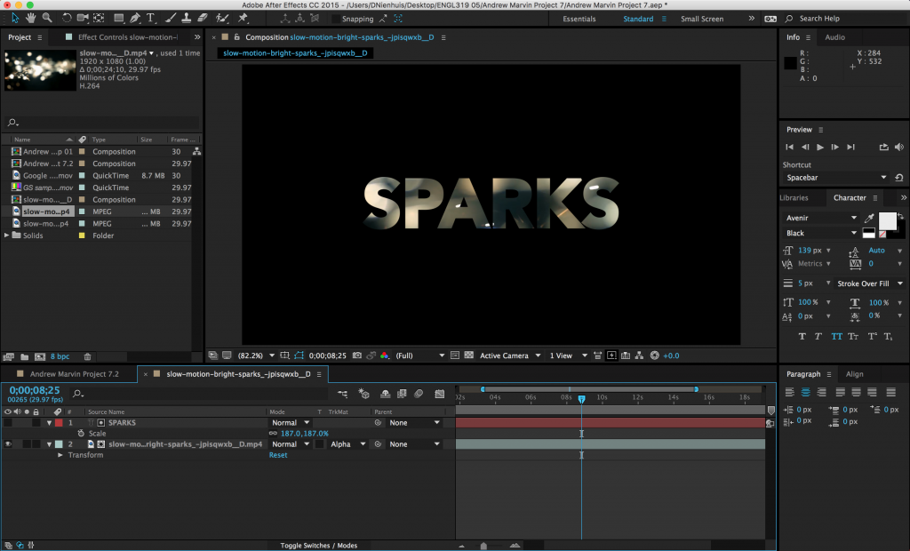
Next to the transfer modes are options for “Track Mattes.”  A track matte tells a layer to look at the layer above it for certain properties.  The “Alpha Matte” and “Alpha Inverted Matte” are particularly useful.  For example, if you put a text layer above a video layer and then set the track matte of the video to Alpha Matte, the video layer will have the shape of the text layer.  Alpha Inverted Matte will cut out the shape of the text.

screen-shot-2016-03-30-at-4-19-06-pm-1024x620

Project 6: Thirds and Titles

Part 1

One thing that After Effects is often used for is the creation of “lower third” graphics.  A lower third is a graphic (usually located in the bottom third of the frame) that contains text information about the subject of the video.  Lower thirds are most often used in interview and documentary footage where the viewer needs to know the name and/or other information of whoever is on screen.

screen-shot-2016-10-12-at-2-22-23-pm screen-shot-2016-10-12-at-4-37-42-pm  screen-shot-2016-10-12-at-4-37-10-pmscreen-shot-2016-10-12-at-2-24-44-pm

This week, we’ll be creating a lower third graphic.  Download one of the videos above and create a lower third for that person.  Here are the parameters:

  • The lower third should be on screen for between five and ten seconds.
  • The graphic should animate on to and off of the screen.  This can be done using opacity, movement, or anything else you like.
  • There should be two lines of text: one of your subject’s name and one of their job or title.  Make something up!
  • Put an easy ease on at least one of your keyframes.

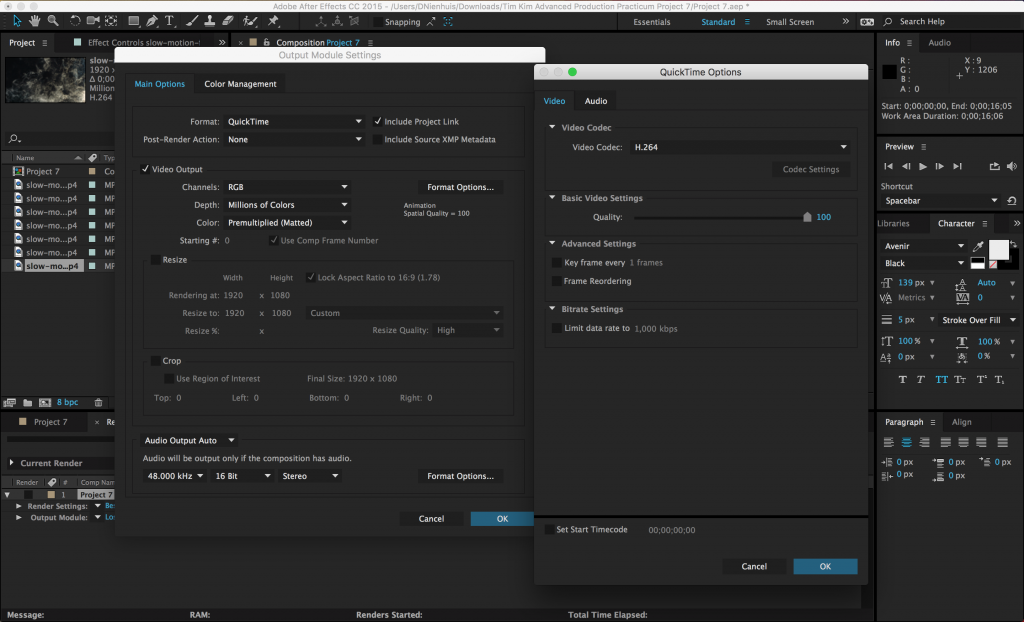
If you need some footage to use as a base for your lower thirds graphics, here are some slow motion clips.  You are also free to find footage or still images on your own.  Render the video at 1920 x 1080 resolution using the H.264 codec and send me a download link!

Part 2

If you did not use After Effects to create a title graphic for your midterm project, I’d like you to create a title graphic for this assignment in addition to a lower third.  Use the slow motion footage as the base to create a title graphic for an imagined project.

  • The composition should be between 10 and 20 seconds long.
  • Since this is a title graphic, some text should be used.
  • Use at least one effect.
  • Keyframe at least one property or effect.

Audio is not required, but you may certainly add some.  Render the title graphic using the same parameters as the lower third and send me a link.  If you already used After Effects to create a title graphic for your midterm, you do not need to do part two of the assignment!

Categories
Weekly Lessons

Week 7: Introduction to Motion Graphics

TAKING GRAPHICS TO THE NEXT LEVEL

Last week, we briefly discussed the general workflow and usage of After Effects.  While After Effects is an incredibly versatile program, it is really designed around the creation of motion graphics.  We were able to do some simple graphics work in Premiere using the Title tool, but After Effects allows us to do much more in a more intuitive interface.

Transform Properties and Effects

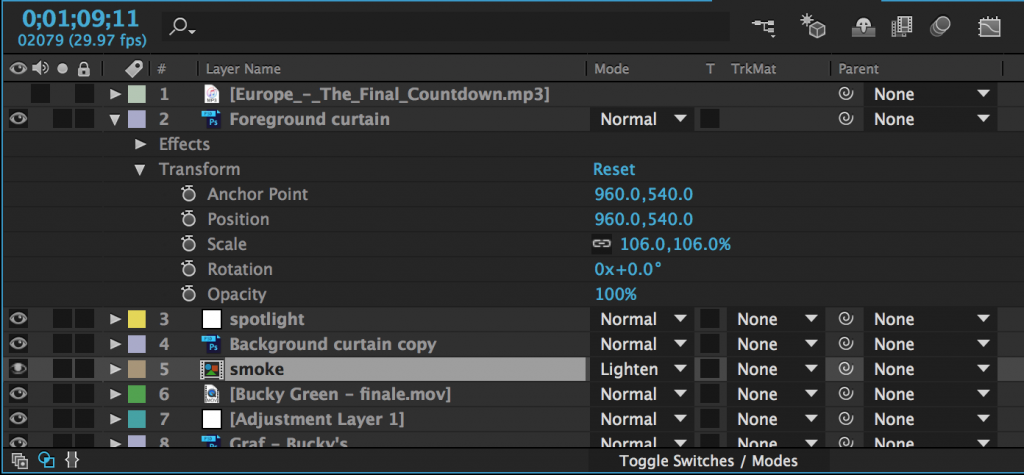
In Premiere, there were a few things that could be adjusted directly within the timeline, but most properties had to be modified using the Effect Controls panel.  After Effects has an Effect Controls panel as well, but it is only used to control effects.  The timeline, on the other hand, allows you to modify much more.  On the left side of each piece of media (or layer) is an arrow that can be tipped down.  Clicking it will reveal three categories of properties that can be adjusted: masks (if any have been added), effects (if any have been added), and a section called “Transform.”  These categories always appear – and are applied – in this specific order: first, masks are applied, then effects, then transform properties.  If your media includes audio, that section will appear last.

screen-shot-2016-03-22-at-2-11-20-pm-1024x475

Clicking “Transform” will reveal a lot of the same properties that appeared at the top of the Effect Controls panel in Premiere: anchor point, position, scale, rotation, and opacity.  Most of these are self-explanatory, although “anchor point” can be a little confusing.  The anchor point is basically the central point in an image or video and changing the anchor point changes the way an object rotates and scales.

You will be adjusting the transform properties a lot when using After Effects, so it’s helpful to know their keyboard shortcuts:

A – anchor point
P – position
S – scale
R – rotation
T – opacity

You’ll notice that next to every transform property – in fact, next to almost everything – is the same keyframe switch we used in Premiere.  By default, keyframes are switched off (the stopwatch icon is greyed-out).  Clicking the icon will turn keyframes on and a new keyframe will be set every time an adjustment is made to that property.

There are many effects built in to After Effects and countless more that can be added using plugins.  The effects are organized into categories under the Effects dropdown and in the Effects panel, which has a useful search bar.  Clicking on a piece of media in a composition and then choosing an effect in either location will add that effect and should bring up the Effect Controls panel.  The effect will also appear in the layer information of the composition in the timeline.

Whenever you add a keyframe to an effect or transform property, that keyframe will appear as a diamond shape on the timeline.  Keyframes can be moved, copied and pasted, or deleted right on the timeline.  A group of keyframes can be scaled up or down by selecting them with the mouse, then holding alt while clicking and dragging a keyframe at the end of the group.  You may need to experiment to see just how this works, but After Effects is designed to make adding and modifying keyframes very easy.  As a result, you can animate properties with very precise control.

To see all the keyframes on a layer, highlight that layer in the timeline and press the U key.  I use this particular shortcut constantly.

Masks

As I previously mentioned, most of the media you add to your composition will have three kinds of properties: masks, effects, and transform properties.  Transform properties and effects will probably be familiar from Premiere, but masks are somewhat unique.  You’ll find the mask tools up at the top of the screen in the tool bar.  There are preset mask shapes (hold-click to see the various options) and a pen tool for custom shapes.  Be sure to select the layer you want to mask in the timeline panel before clicking on a mask tool.

screen-shot-2016-03-22-at-3-52-16-pm-1024x285

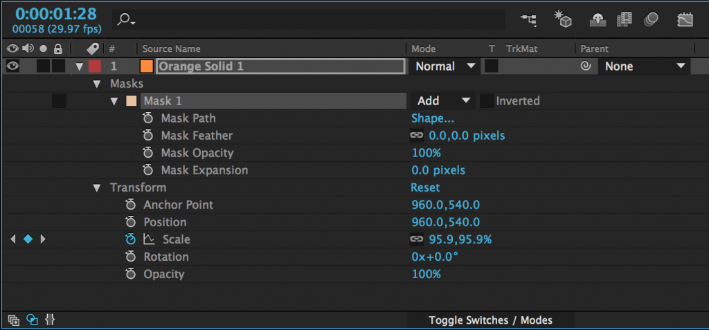
After you add a mask to an object (with either a shape tool or the pen tool), it will appear as a property of that layer in the timeline panel.  Next to the name of the mask, you’ll find a dropdown menu – the default value should be “Add.”  This means that the mask is “adding” that area and discarding everything else.  If you change this to “Subtract,” the area of the mask will be taken away and everything else will remain.  Choosing “None” will make the mask have no effect.  There are several other options as well, but add and subtract masks are what you will use most of the time.

There are a number of options for further modifying the mask, which are available by clicking the triangle to the left of the mask’s name.  Mask Path allows you to keyframe the mask’s shape (we’ll discuss this further in another session); Feather fades the edges; Opacity changes the transparency; and Expansion allows you to grow or shrink the mask.

screen-shot-2016-03-22-at-4-13-32-pm-1024x477

Solids and Text

In addition to media that you import, you can create layers to add to your composition from within After Effects.  The most common are solids and text layers.  To create one, go to the Layers dropdown menu at the top of the screen, select New, and choose Solid or Text. When you create a new solid, you’ll see a menu with options for name, size, and color.

Unlike Premiere, which opens up a new panel for text creation, the controls for text layers are broken down into panels in After Effects.  The Character panel modifies the font, color, size, kerning, and more; and the Paragraph panel modifies the alignment.

You may be surprised at how often you use solids in After Effects.  Their most obvious use is as a simple shape — in a motion graphic or title, for example.  However, they are also a blank slate for adding other effects.  You can use the effects in the “Generate” section to transform a solid into animated “radio waves,” or a checkerboard pattern, or a complex fractal.  You can create a noise or static pattern using the “Noise & Grain” effects.  You can quickly make snow or rain with the “Simulation” effects.  Take some time to play around with solids in After Effects — they are, in a sense, the most basic building block in the program.

Exporting Using the Render Queue

Exporting your finished project in After Effects is a little more complicated than it is in Premiere.  The best way to export in After Effects is using the Render Queue.  The Render Queue exists as a panel in After Effects – it may show up as a tab next to the compositions in the timeline (otherwise, you can always find it under the Window dropdown at the top of the screen).

screen-shot-2016-03-30-at-5-00-39-pm-1024x245

To add a composition to the Render Queue, open the composition in the timeline, then go to Composition>Add to Render Queue.  The name of the composition should then appear in the Render Queue panel.  Before you hit the “Render” button, you’ll need to set a few parameters.  Unless something has been changed, everything in the Render Settings section should be fine at the default values.  The Output Module is where you actually make changes to the file type and codec, so click on that to bring up a window with lots of options.  For our purposes, just click on “Format Options…” and change the video codec to H.264.  Click OK to close each window.  Finally, set the file’s destination by clicking on the text next to “Output To:”.

What’s great about the Render Queue is that, if you are working on multiple compositions, you can add them all, then render them together.  Just repeat the process of adding them to the queue and adjusting their settings, then hit Render.

screen-shot-2016-03-30-at-5-03-10-pm-1024x622

Assignment 6 (Optional): Titling in After Effects

Since you all are finishing up your midterm projects, there is no required assignment over the break.  However, if you would like to use After Effects to create a title graphic for your midterm project, that will count as a future assignment.  In other words, you can do this assignment now, as part of the midterm, or later, as part of another project when we return from break.

If you decide to use After Effects in your midterm project, simply replace the title graphic you would have done in Premiere with one you make in After Effects.  The title graphic should include the name of your chosen work and the original author.  You may also include your own name, if you like.  Feel free to play with properties, effects, masks, and solids – and you must use keyframes to animate at least one of these elements.

If you don’t want to get that far into After Effects just yet, that’s fine too – just be ready to hit the ground running when we return!

Categories
Weekly Lessons

Week 6: What Is After Effects?

AFTER EFFECTS VS. PREMIERE PRO

It’s a bit difficult to describe what kind of program After Effects is, because it’s fairly unique in the world of post-production.  It may actually be simpler to say what After Effects is not.  After Effects is not an editing platform.  While it’s possible to make cuts and render a sequence of shots, After Effects’ timeline and workflow aren’t designed for the editing process in the same way that Premiere’s are.  After Effects is not designed for advanced color grading or audio mixing – Adobe makes separate programs for those tasks and the built-in tools inside Premiere are more advanced than those in After Effects.  After Effects is also not designed for complex art creation like Photoshop, Illustrator, or 3D modeling software.

Programs like Premiere, Audition, and SpeedGrade are designed around editing media.  After Effects is designed around creating media, often using assets created in programs like Illustrator and Photoshop.  After Effects is the perfect application for building animated titles and lower thirds.  It’s a powerful tool for character animation.  It can be used for compositing and special effects work.  It is most often used in concert with other programs to create sophisticated video content.

After Effects is also deeply customizable.  There are countless plugins and presets available for After Effects that can completely alter the capabilities of the program.  These run the gamut from 3D modeling to automated text animation to particle effects and everything in between.  Websites like aescripts and Video Copilot are fantastic resources for adding functionality to the application.  Larger companies like Red Giant and GenArts make more sophisticated  — and expensive — add-ons for even more advanced professional-grade work.

However, even without external plugins, After Effects is an incredibly powerful platform for media creation.  The program is built around the ability to quickly and easily animate just about any property or effect using keyframes.  While some of this functionality is present in Premiere, it’s buried in menus and not especially intuitive.  After Effects puts it front and center.

Setting Up A Project

When you open up After Effects, you’ll likely see a splash graphic with the usual options for starting a new project or opening an existing one.  However, unlike Premiere, After Effects does not require you to set a project location or save before you start working.  I’d recommend using the same practices we discussed for Premiere projects when working in After Effects: keep everything organized in a central folder, sort your media by type, and save frequently.

The After Effects workspace is a little different than the Premiere environment, but there are lots of analogous panels.  The “Project” panel is where media is imported and stored (although, like Premiere, no media is actually moved on your hard drive — it is only referenced in its existing location).  There is still a prominent “Timeline” panel, although the After Effects version has a slightly different structure and you create “compositions” instead of “sequences.”  There is no Source Monitor, but the “Composition” panel operates much like the Program Monitor.  You’ll again be doing a lot of work in the “Effect Controls” panel and the tools for text editing are standard panels, not a separate menu.  Like all Adobe programs, everything is extremely customizable; panels can be resized and rearranged and there are several workspace presets.  If you’re ever looking for a particular panel and can’t find it, the “Window” dropdown should help you locate it.

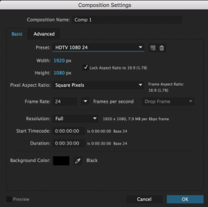
As I mentioned, in After Effects, you’ll be working in compositions, not sequences (which is what Premiere uses).  You can create a new composition by hitting command-N, selecting New Composition from the Composition dropdown menu, or by clicking the icon that looks like a scene inside a filmstrip at the bottom of the Project panel.  You’ll be greeted with a menu that gives you options for resolution, frame rate, and the duration of the composition.  There are several presets to choose from and – unlike Premiere – they are actually pretty helpful.  I use HDTV 24 or HDTV 29.97 most of the time.

screen-shot-2016-03-02-at-7-34-07-pm-768x762

Hitting “OK” will open up a new blank composition.  You’ll be dragging media into the Timeline and your work will be visible in the Composition panel.  Unlike Premiere, there are no pre-determined audio or video “tracks” in the Timeline window; pieces of media simply stack on top of each other.  Every video or audio clip, still, adjustment layer, text, and shape appears as its own layer in the Timeline.  You can also drag one composition into another or put footage into a “pre-composition” (much like nesting in Premiere).  You can rename media in either the Timeline or the Project panel by highlighting something and hitting return.

screen-shot-2016-03-02-at-7-56-33-pm-1024x209

We’re not going to delve into the finer details of After Effects just yet.  For the time being, just explore the interface and how media is handled by the program.  Some things will be familiar and some will be very different.  After Effects in incredibly powerful and versatile, so it’s important to have a solid grasp of the essentials before we explore further.

Categories
Weekly Lessons

Midterm Project Details

BRINGING IT ALL TOGETHER

We’ve now covered a lot of different topics in Premiere: sound mixing, color grading, green screen work, and the general editing workflow.  We’ll be moving on to After Effects soon, although we’ll continue to use Premiere throughout the semester.

Over the next two weeks, we’ll be focused on two things.  We’ll start to go over the basic workflow of After Effects and discuss the ways that it’s similar and different from Premiere.  We’ll also cap off our section on Premiere with a mid-semester project.

Midterm Project: Images and Voices

Your midterm project is to use the skills you’ve learned throughout the semester thus far to create a video based on a piece of spoken-work audio.  If you go to voicesinthedark.com, you’ll find a variety of audio content in mp3 form – poetry, fiction, and essays.  You can also find readings of the pieces on Bucknell’s own Poetry Path at bucknell.edu/poetrypath.  I’d like you to choose a work, or a section of a work, between 30 seconds and two minutes in length.  Using that as a base, create a video.

  • Play with the audio!  Be sure to incorporate sound effects, ambient noise, music, or all three into your finished piece.  Check out the Resources section of the blog and the sound mixing lesson for some helpful links.
  • Use cool footage!  You can use video clips from previous assignments, grab stuff from the Prelinger collection or archive.org, or use clips from this collection of vintage carnival footage.  You are not required to use any specific footage, so feel free to find or film something on your own.
  • Make it interesting!  Don’t just throw in effects or transitions randomly, but feel free to experiment with different techniques.  Use the skills you’ve been developing thoughtfully, including color grading and keyframed properties.  You are not required to use green screen compositing, but you are welcome to!
  • Incorporate a title graphic that has the title and author of the work you choose.

Please complete a first draft of this project, render if using the Vimeo 1080HD preset in the H.264 format, and email a download link to me by next Thursday.  The project does not need to be completed, but you should have a working draft that you can share with the class.  Next week, we’ll look at everyone’s projects, give some feedback, and complete them.

As always, let me know if you have questions or need any assistance.  Have fun!