Categories
Weekly Lessons

Week 5: Green Screen 101

COMPOSITING IN PREMIERE

Chroma-key compositing has been a staple of the special effects industry for decades, but it’s only in the last few years that the capability to good-quality, sophisticated compositing has become widely accessible.  For advanced compositing work, you should probably use software that’s effects-focused, such as After Effects (we’ll cover green screen work in After Effects during the second half of the semester).  However, the compositing effects in editing programs such as Premiere have gotten good enough to use for quick, relatively simple green screen work.

While it’s commonly referred to as “green screen,” you can (in theory) use any color for compositing.  Blue was the color of choice for a long time, but green eventually became more widely adopted because it’s less common on articles of clothing.  Both blue and green – and occasionally other colors – are still used.

For the best results, the screen should be smooth, saturated, and even.  There needs to be good separation between the subject and the screen, so a backlight is often helpful.  The Marts video studio has excellent green screen facilities, with green lights positioned to augment the curtain.

Before you actually start keying out the green screen, you may need to crop out some of the frame.  Go through your footage to double check the movement of your subject and find any unwanted objects in the frame.  The simplest way to cut out sections of the frame is using the Crop effect, which allows you to bring in the edges of the image.  I often use this to cut out light stands or uneven sections of the screen.  If you need to make more precise crops, try a Garbage Matte effect instead.

Ultra Key

There are lots of chroma-key effects in Premiere, in the “Keying” folder.  I’ve gotten the best results by far using Ultra Key.  After you apply the effect, you’ll need to choose the Key Color using the eye dropper.  There may be some variation in the color of the screen – try to click on a section that’s saturated and fairly close to the subject.  You should notice an immediate effect after choosing the Key Color.

While the initial result may look good, you’ll want to switch your view (under Output) from Composite to Alpha Channel to see how effective the key actually is.  This will switch your view to a black and white silhouette – black areas are keyed out and white areas will remain.  Your goal is get get rid of all grey areas and get an Alpha Channel view that is purely black and white.  To do this, adjust the parameters under Matte Generation.  There are several sliders to play with; I’d honestly recommend going through them in order and seeing how they affect the image.  I generally have good luck adjusting the Highlight, Shadow, and Pedestal.  You should be sure to occasionally scrub through the footage, to make sure that the lighting situation doesn’t change during the shot.

green-shots-01

Once your Alpha Channel image looks good, switch back to the Composite view – the subject should now be neatly isolated against a black background.  If the edges of your subject look rough, try modifying the properties under the Matte Cleanup area of Ultra Key.  Choke will expand or contract your keyed area, while Soften will blur the edge – this can make your key look more natural.

Sometimes your footage may be a little under-saturated, which can make pulling a clean key difficult.  When this is the case, you can use an effect like Fast Color Corrector or RGB Curves to add saturation to the green before you apply Ultra Key.  Remember that the order of the effects in the Effect Controls panel makes a difference.  If your resulting footage looks odd, you can always apply another color correction effect after the Ultra Key to bring it back to the desired look.

When you choose a background for your chroma-keyed footage, remember to consider the perspective of the subject and try to match it as closely as possible.  Lighting, color balance, and saturation are also factors to consider, even when using abstract or indistinct backgrounds.  I often add a small amount of blur to the background to help everything mesh together.  As a final step, you could nest the composited footage (or use an Adjustment Layer) to apply color correction to both layers simultaneously – this also helps the footage look uniform.

green-shots-02

Project 5: (It’s Not Easy) Keying Green

For this assignment, download the green screen footage that we captured today, along with two of the background video clips below.

screen-shot-2016-09-21-at-3-00-03-pm screen-shot-2016-09-21-at-3-00-31-pm screen-shot-2016-09-21-at-3-01-19-pm screen-shot-2016-09-21-at-3-01-38-pm screen-shot-2016-09-21-at-3-00-54-pm

Create two scenes, one for each background.  Between the two backgrounds, incorporate all of the clips we filmed today, using Ultra Key for compositing.  You’ll probably need to adjust the scale and position of the green screen footage to make the composition work.  You’ll also want to do some color correction so that the subjects match their respective backgrounds.  Render your two clips together as a single video using the usual settings (H.264 format, Vimeo 1080HD preset) and email me a download link.  Happy keying!

Categories
Weekly Lessons

Week 4: Color Correction and Grading

COLOR CORRECTION AND GRADING

Few things transform a project like color grading.  Just like altering music can take a scene from sentimental to scary to silly, color grading can completely alter the feel of the footage you’re working with.  Some feature films have incredibly stylized color grades – think about how different O Brother, Where Art Thou?The Matrix, 300, Traffic, or  Moonrise Kingdom would be without their distinctive color palettes.  Even on films where the color grading doesn’t draw attention to itself, the look of the film is always a conscious choice.

Until relatively recently in the history of cinema, color grading was a purely chemical process.  Film negatives could be exposed to different chemicals for different amounts of time to bring out the reds, greens, or blues in the image (this is why color correction is sometimes referred to as “color timing.”)  Additionally, various bleaches, washes, and other photochemical processes could be used to affect the final image.

The advent of digital post-production has made this process more about art and less about science.  While it’s still important to be knowledgeable of the process and thoughtful during filming, color grading has become increasingly accessible and adaptable.  The most recent iterations of Premiere (since CC 2015) have added a new suite of tools, allowing you to do fairly sophisticated grading from directly within the editing program.

Fixing Color and Creating Style

The terms “color correction” and “color grading” are used fairly interchangeably, but I’d like to draw some distinctions between the two.  I think of color correction as the initial step – the process of getting your footage to match and fixing any glaring issues.  Most often, this entails basic fixes to things like white balance and exposure.  I think of color grading as the step where you take your corrected (“fixed”) footage and stylize it.  This may involve things like the saturation, warmth or coolness, and contrast.  It’s also the stage where you would add effects such as a vignette or film grain.

One of the additions to the CC 2015 version of Premiere is the “Color” workspace, which can be accessed from the bar at the top of the program or the Window dropdown menu.  The Color workspace is designed around the new Lumetri Color effect, which is Premiere’s most extensive color feature.  Lumetri is essentially a simplified and condensed version of SpeedGrade (Adobe’s dedicated color grading software) running within Premiere.  The Color workspace also adds a reference panel displaying “Lumetri Scopes,” which can be configured to show image information such as a histogram, vectorscope, or parade.  We’ll be using the RGB parade, which shows the spectrum of red, green, and blue within an image.

In a “balanced” image, there will be roughly the same amount of red, blue, and green in the entire image.  In terms of exposure, most of the RGB parade should be in the middle of the graph.  Of course, if your shot is intentionally dark, light, or features a certain color prominently, your RGB parade will look different.  It takes some time to get used to reading scopes, but they can be a great way to quickly see where the potential issues are in your image.

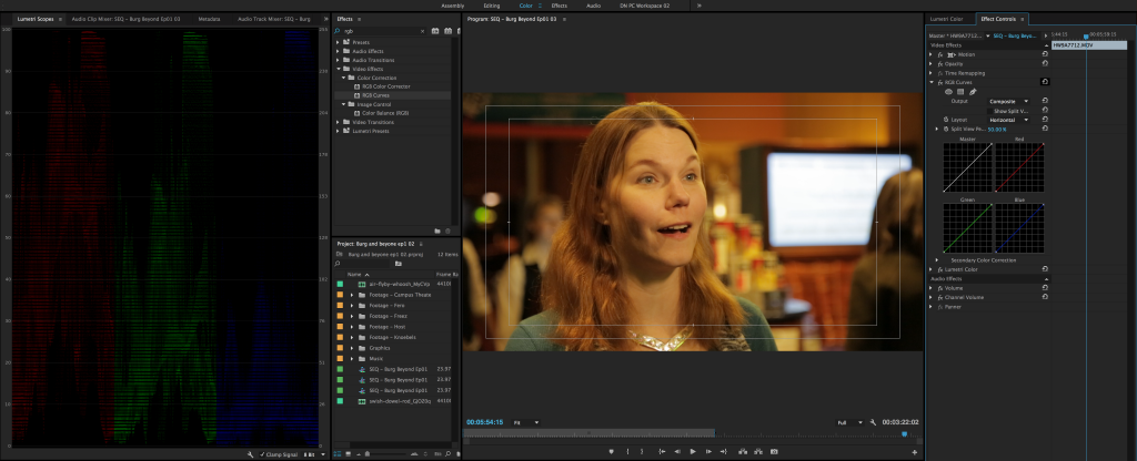
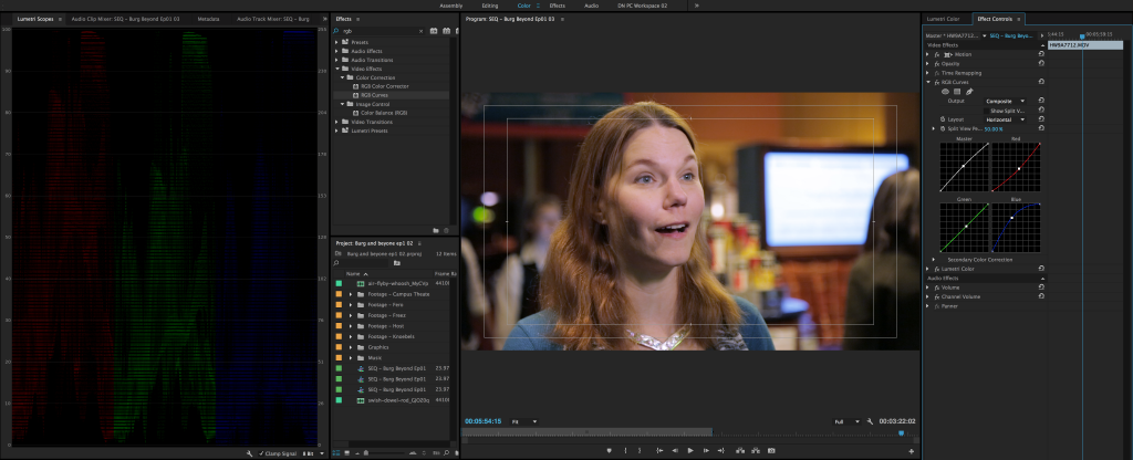
Before we dive into Lumetri Color, let’s look at color correction at its most basic form, using the RGB Curves effect (note that you may need to locate the Effect Controls panel using the Window dropdown).  RGB Curves allows you to adjust the three primary colors in the image using points on a line graph.  The brightest white is located in the upper right corner and the darkest black is in the lower left.  By placing and manipulating points on the curved line, you can change the amount of each color in the image.  The white “Master” line affects overall exposure.  You should definitely take some time to play with this effect to see how an image can be changed.  I often use the RGB curves to do a quick color correction pass to footage before diving into finer grading.

screen-shot-2016-02-23-at-2-15-36-pm-1024x416

screen-shot-2016-02-23-at-2-15-22-pm-1024x416

Lumetri Color

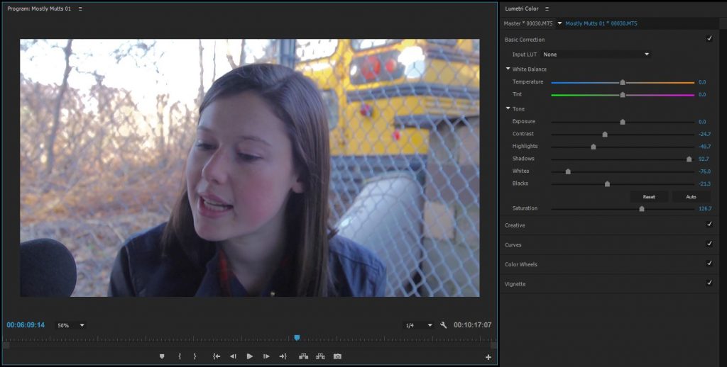
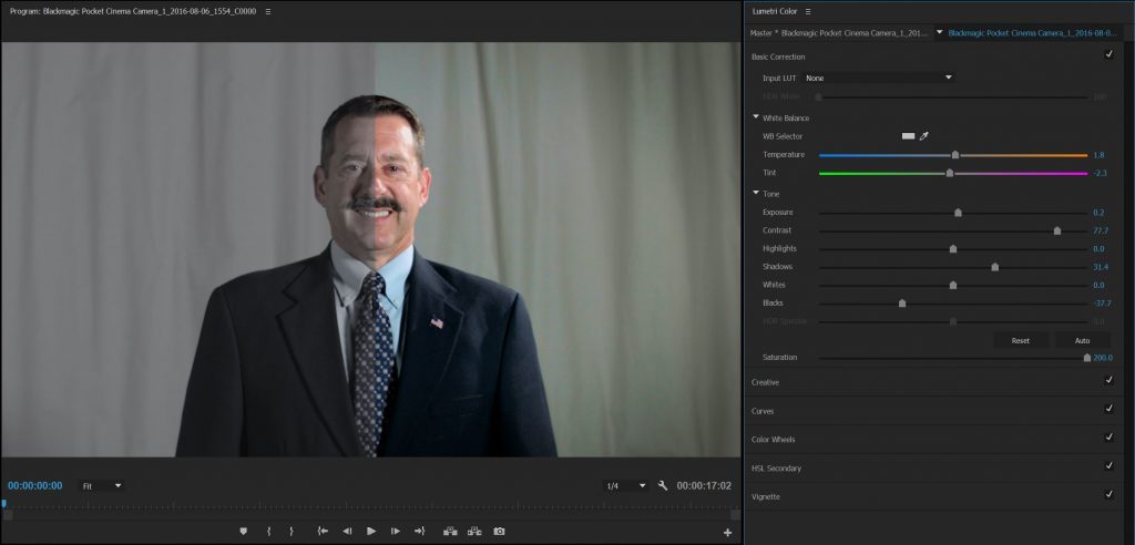
For more advanced color grading and styling, let’s move on to the Lumetri Color effect.  Lumetri Color is in the Effects panel, under Color Correction, but it also has its own panel in the Color workspace.  If you start making changes in the Lumetri Color panel with a clip highlighted, the Lumetri effect will be added to that clip automatically.

gradecapture

Lumetri Color is comprised of five sections: Basic Correction, Creative, Curves, Color Wheels, and Vignette.  Basic Correction is made up of sliders to adjust the overall color temperature, exposure, and saturation of the image.  The Basic Correction controls can be used to do the same kind of “quick fix” work that we just did with the RGB Curves effect, although I find that the RGB curves give a bit more control.

In the Creative section, you’ll find a number of preset “looks,” which can be quickly applied to your clip, as well as a slider to change how much the preset is applied.  The looks can be fun to play with, but I’d encourage you to experiment with creating your own style by dialing in the different parameters yourself.  Creative also has some tint and saturation tools which can be useful; in particular, there are color wheels for tinting the shadows and highlights.  Often, you can give your footage an interesting look by tinting the shadows and highlights differently (such as cool shadows and warm highlights).

In the Curves section, you’ll find a set of RGB curves that are nearly identical to the effect we discussed earlier.  The reason I prefer to use the Curves effect separately is that it allows me to apply a general fix before any of the Lumetri stylization.  That being said, I will often use the Lumetri curves to further refine the look of the footage.  There is also a “Hue Saturation Curve” which allows you to precisely control the saturation of different colors in your image.

Below the Curves section are the Color Wheels.  These allow you to control the hue and saturation of the shadows, midtones, and highlights of the image individually.  The three wheels replicate the physical controls used in a professional color grading suite – if you’ve ever seen a colorist using three large trackballs to adjust footage, that’s what these correspond to.

The last section of Lumetri Color is the Vignette.  Pulling the “Amount” slider into the negative will add a dark vignette; pulling it into the positive will add a light vignette.  A dark vignette is a quick and effective way to make footage look just a bit more polished and interesting.  Vignettes draw the eye to the middle of the frame and the gradual falloff often makes backgrounds look more dynamic.  That being said, it is very easy to overuse vignettes — ideally, the effect should be almost subconscious.

Flat/Log Footage

Because color grading has become such an integral part of the post-production process, many cameras now offer “flat” picture profiles or “log” modes.  This footage generally looks worse right out of the camera – desaturated and without much contrast.  The benefit of log-style footage is that a wider range of exposure can be captured, so you’ll be able to see more in the highlights and shadows.  It’s also quite easy to add saturation and contrast to an image.  Log footage allows you to color correct and grade the image more aggressively – it’s like having a neutral base to start from.  The downside is that log footage really needs to be graded before it’s at all usable – the initial image just isn’t aesthetically pleasing.

color-grade-test-1024x492

Project 4: Crafting Color

Download this zipped file – it contains a folder with footage, sound effects, and a Premiere Pro project file.  The file is somewhat large, around 2.5GB, so be aware of that when downloading.  If you open the Premiere file (“Color Grading Project”), you’ll see that there are three sequences inside: Grade 1, Grade 2, and Finished Project, which contains nested copies of Grade 1 and Grade 2.

Your assignment for the week is to give Grade 1 and Grade 2 different color treatments.  You’ll probably want to start with some basic correction: removing unwanted color casts and getting the individual shots in the sequences to match.  From there, stylize the two sequences to make them unique.  You might make one warm and idyllic and the other cold and mysterious.  Or try playing with different genre looks: horror, noir, period drama, sci-fi, and so on.  Use color temperature, saturation, contrast, vignetting, and the other tools at your disposal to give the same piece of footage two different looks.

Once you’ve finished working with Grade 1 and Grade 2, open the Finished Project sequence.  You should see both versions of the footage along with a short title before each one.  Put a name for each look in the appropriate title graphic.   As an optional bonus, feel free to add some music to each sequence, but please don’t change the video footage (other than applying the color treatment).  Render the Finished Project using the Vimeo 1080HD preset in the H.264 format.  Oh, and please incorporate your name or Bucknell ID in the name when you export the finished project.  Upload the finished video to your Google Drive and send me a download link by next Thursday, September 22.  Have fun!

Categories
Weekly Lessons

Week 3: Sound Mixing and Design

AUDIO MATTERS

Although it’s often under-appreciated, sound is just as important as visuals when it comes to creating compelling video.  In fact, you could make the argument that sound quality is more important than having good-looking footage.  As a viewer, you can adjust to footage that’s less-than-perfect; grainy, “vintage” visuals can be a stylistic choice, after all.  You cannot ignore bad sound, though.  Bad audio is always distracting – it’s probably the single biggest factor that keeps amateur work from seeming professional.

This class is focused on post-production, so we won’t spend much time going over what you need to do to capture good sound on set.  The most important things are to use decent equipment, get the microphone as close to your subject as possible, monitor your levels constantly, and to take your time with it.  Spending an extra twenty minutes on set setting up your audio effectively can save you hours when you get to the editing stage.

This week, we’ll look at two aspects of audio post-production: basic mixing/repair and sound design.

Mixing

When it comes to dialing in the levels of your audio media, you have two basic tools: the Track Mixer and the audio section of the Effect Controls.  As we discussed in week two, it’s generally best to sort different kinds of audio onto different tracks.  For example, you can place a voice over clip on one track, music on a second, and sound effects on a third.  Of course, it’s not always possible to do this – you may need multiple tracks for overlapping sound effects, for example.  If you’re fairly consistent, though, you can quickly make broad changes, such as lowering the maximum volume of all the music in your project, or raising the volume of all the in-camera audio.

The Audio Track Mixer will probably be hidden by default, so you may need to find it using the Window drop-down at the top of the screen (note that there is a “track” mixer and a “clip” mixer – we’ll be using the Track Mixer).  There will be a volume slider for every audio track in your sequence, along with a master control on the far right.  You can set a fixed volume adjustment or pan, as well as toggle the mute and solo from this panel.

Finer adjustments (and keyframed properties) can be made in the Effect Controls panel.  Audio effects (found in the Effects panel) can be added and reordered and properties like volume and pan can be changed and/or keyframed.  Note that the keyframe icon may be turned on by default on some properties, so be sure to switch it off if you are making an adjustment, but don’t want to animate the property.

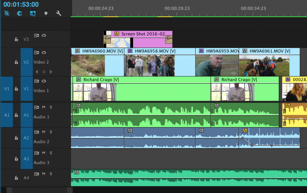
You can also make volume adjustments to clips directly in the Timeline.  If you expand an audio track to the point where you can see its waveform, you should see a fine white line in the middle of the track.  Dragging this up and down will adjust the volume.  You can also choose the pen tool and make keyframes on the line.  These keyframes will appear in the Effect Controls.  The pen tool is a great way to clip out problematic sections of audio or make detailed volume adjustments.

Screen-Shot-2016-02-10-at-12.49.50-PM-1024x645

When it comes to actually mixing the audio in your project, there are a few things to keep in mind.  First, you want to avoid having any of your audio peak, or blow out.  As your project plays in the Timeline, the audio meters off to the right side will show the master volume.  If this crosses over 0 dB, the top of the meter will turn red.  Adjust the clip (or the entire track, using the Track Mixer) to avoid this.  As a general rule, your master audio level should hit between -6 and -12 dB most of the time.  Occasionally going higher or lower is fine, as long as you avoid peaking.

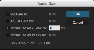
screen-shot-2016-09-07-at-4-48-40-pmIf you have an audio clip that was recorded too low or too high, you can also make an automated adjustment called “normalizing.”  Right-click on a clip and select “Audio Gain…” – this will bring up a small menu with a few different options.  You can either normalize the “max peak” or “all peaks” – the two work in similar ways, so you probably won’t see a huge difference between the two.  Keep in mind that since this is an automated effect, you’ll want to pay close attention to how it changes your clip.  You can also set or adjust the gain of a clip in this menu, if the volume controls in the Effect Controls window are insufficient.

You also want to avoid having  any sections where there is a complete lack of sound in your project.  Even during moments where no one is speaking and no music is playing, you want some base level of noise in your sequence.  The almost-imperceptible ambient sound of a space is called room tone.  Ideally, you should have recorded room tone at every location filmed at for your project.  Of course, that’s often not the case, so you may need to either record or find something.  Again, you just want to avoid complete silence; having all audio drop out is jarring and uncomfortable for the audience.  That being said, it’s also a good idea to add a brief fade-in and fade-out to your audio at the beginning and end of your project.

Repairing poorly recorded audio in Premiere generally involves either removing unwanted sounds (such as tapping or rustling), filtering out persistent tones (such as static or hiss), or fine-tuning inconsistent levels.  Clipping out unwanted sounds can be done using either the pen tool or the razor blade.  You may need to “patch” some sound in using room tone.  Filtering out background sounds can be done using filters in the Audio Effects folder.  I’d recommend the “de-noiser” effect for removing unwanted hiss and the like.  The best way to get a handle on these tools is to simply use them, so please experiment.  Inconsistent levels can be fixed using either the pen tool or the volume property in the Effect Controls window.

Tracks and Channels

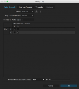
To make the layout as clean and accessible as possible, Premiere can actually display multiple channels of audio on a single track – for example, if you import a piece of video with stereo sound, both the left and right channel may be on the same track.  This is generally fine, but sometimes, you may want to use only the left or right channel in your project.  This is often the case when you record footage with an external microphone; the left channel might have the clean audio from the microphone, but the right channel might have the scratchy audio from the built-in microphone, or no audio at all.

screen-shot-2016-09-08-at-2-26-27-pm

Fortunately, it’s simple to change the way audio channels behave in Premiere.  Simply right-click on the audio channel of a clip and choose “Audio Channels.”  A menu will open with check boxes for which channels you wish to use.  If your good audio is on the left channel, simply select “L” under “Media Source Channel” for  both of the clip’s channels.  That sounds slightly confusing, but it’s quite simple in practice.

If you want to separate your audio track from the video track, you can right-click on the track and choose “Unlink.”  This will allow you to slide either the audio or video around independently.  You can also option-click on either the audio or video part of a clip to select only that aspect, then move or delete it.

Sound Design

It’s important to remember just how much sound can alter the feeling – or even the meaning – of footage.  Music is the obvious example, since it can alter a scene’s tone so drastically, but it’s definitely not the only tool you have at your disposal.  Sound effects (when used right) can draw attention to actions, or imply something happening off-screen.  Using effects on audio can make things seem dreamy, or intense, or frightening.  Using ambient tones beneath “normal” sounds can make a scene suddenly ominous.

In our day-to-day lives, we constantly being exposed to sounds that we tend to “tune out” automatically: a ticking clock, the hum of a heating system, the murmur of traffic.  In video production, you are often starting from scratch, so it’s important to think about what needs to be included.  You (generally) don’t want to overwhelm your audience with a wall of competing sounds, but you also (generally) don’t want your scene to feel stark and lifeless.  I’d recommend starting with any dialog or voice over, then adding room tone, then thinking about sound effects.  Remember that it’s okay to be subtle.

Adding music is usually the final step, at least for me.  I’m generally looking for music that will enhance and amplify the scene I’m already building, without taking it over.  Of course, for things like music video work, the opposite is true.  Also, I’d really recommend avoiding music that you don’t own the rights to use; it will save you headaches down the road and force you to be creative with your audio choices.

I recommend that you do your sound work wearing a decent pair of headphones – unless you have a very controlled environment, external speakers won’t give you a sense of what things sound like.  However, once you have things mixed, take a listen without headphones, to make sure things still sound good.  Every set of speakers and headphones sounds slightly different, so you may have to listen a few times and make adjustments – but you should always start with headphones.

Project 3: Sculpting Sound

For this week’s project, I’d like you to add sound to an existing piece of footage.  Below are links to five different pieces with no audio.  Download one of them and give it a soundtrack.  This should be comprised of at least three different kinds of audio; for example, you might include music, ambience/room tone, voice over, and sound effects.

psychedelic_bic_lighters-00_00_07_08-still001 psychedelic_bic_lighters-00_01_01_26-still002 psychedelic_bic_lighters-00_01_37_05-still003 psychedelic_bic_lighters-00_02_17_14-still004 psychedelic_bic_lighters-00_02_43_27-still005

For audio content, there are a few places you can draw from.  I’ve used findsounds.com many times for random sound effects.  Bucknell also hosts a very impressive library of sound effects, which can be accessed using the following steps:

  1. Connect to the “Projects” server on netspace (smb://netspace.bucknell.edu/projects)
  2. Navigate to “TheatreSoundFx” folder
  3. Using the Finder (on a Mac), search the TheatreSoundFX folder for what sound you’d like to find
  4. Copy/Paste files you like into your media folder on your local computer or hard drive

If you’re looking for music, I’d suggest incompetech.com and the Free Music Archive.  You can also find both music and sound effects in YouTube’s Audio Library.

I’ll be grading this project on a few factors: following the guidelines, using sound effectively and creatively, and avoiding peaking unpleasant cuts in or out..

After you’ve done your editing, export the finished piece using the H.264 format and the Vimeo 1080HD preset.  Upload it to your Google Drive and send me the link to download it!  As usual, get it to me by next Thursday morning, so that I can upload them to the course website.  Have fun!

Categories
Weekly Lessons

Advanced Basics Part II

BEYOND BASIC EDITING

Once you have a solid grasp of the basic Premiere Pro workflow, you can incorporate increasingly advanced techniques into your work.  Here are the areas that we didn’t get to cover in week two.

Text Titles

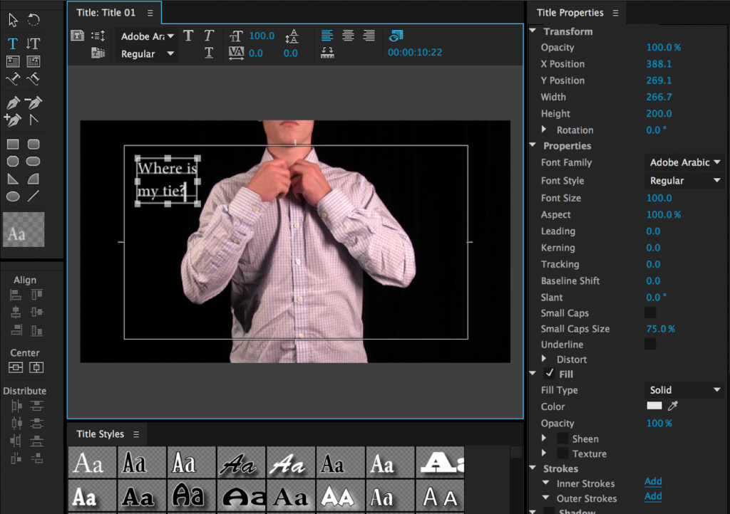
You can add text titles to your project by clicking the New Item icon in the Project Window and choosing Title.  Clicking this will bring up options for the title’s name and format, but it will default to whatever the settings are in the currently open sequence.  Clicking OK will bring up a new window with options for adding text and shapes.  The video in the title window will be whatever the playhead is on in the Timeline.  You can choose the text tool, click anywhere on the video, and type in a title.  This can be moved and scaled, and fonts can be chosen from the drop-down menu at the top.  You can adjust the fill, stroke, opacity, and drop shadow from the Title Properties on the right-hand side of the window.  There are also useful alignment tools on the left-hand side, if you want to be sure your text is centered horizontally or vertically.

When your title looks the way you want it to, you can close the window.  It’s important to note that titles are not added to the sequence automatically – instead, they show up in the Project Window.  You can drag them into a sequence from there, then adjust their length by grabbing an end with the mouse and pulling them longer or shorter.  Be sure to put your title on a track above your video – if it’s below, you won’t be able to see it.

Screen Shot 2016-09-06 at 4.08.35 PM

Keyframes

Most things that appear in the Effect Controls window will have a small stopwatch icon to the left.  Clicking this icon turns keyframes on and off.  Keyframes mark a certain value at a certain time.  If you set a scale keyframe of 100% at 00:00:05:00 (five seconds, zero frames on the timeline) and another scale keyframe of 150% at 00:00:15:00 (fifteen seconds, zero frames), the media will increase in scale by 50% over a period of ten seconds.  You can use keyframes to animate various properties and effects.  A slow animation on the scale of a piece of static footage can make the shot more visually engaging.  Animating opacity (especially with one piece of footage over another in the timeline) can give unique, surreal results.  I’d suggest being conservative with your use of techniques like these, but you should absolutely start playing with them and testing how they work.  This is the type of editing that gives a finished piece a level of professional polish.

Be sure to take note of whether the keyframe “stopwatch” icon is blue or greyed-out.  Most properties have keyframes turned off (grey) by default, but a few are turned on (blue) by default.  If the icon is blue, making any change to that property will set a keyframe.  If the icon is grey, you can still make changes to the property, but those changes will be static, not animated over time.

Moving from the Effect Controls to the Timeline, you can add keyframes directly to pieces of media using the pen tool (P).  If you expand a video or audio track, you should see a thin line.  On video tracks, this controls opacity; on audio tracks, it controls volume.  Click on the lines with the pen tool to create keyframes, then drag them around to animate these properties.  For all keyframeable properties, clicking the stopwatch icon again will erase all keyframes and clicking the circular arrow to the right will reset everything to its default value.

Adjustment Layers and Nesting

Adding effects to individual clips is fine, but there may be times when you want to apply the same effects to many clips at once.  For example, if you edited a project, then decided you wanted everything to be in black and white.  You could apply the “Tint” effect to each clip, or you could use an adjustment layer to affect everything.  Adjustment layers look like blank pieces of video media.  When you apply an effect to an adjustment layer, that effect will appear on everything below it on the Timeline sequence.  For example, if we placed an adjustment layer on video track V3 and added the “Tint” effect, that effect would appear on the stills and video clips on tracks V1 and V2.

You can create an adjustment layer using the “New Item” icon in the window with all your project’s media — it looks like a square with a folded corner.  An adjustment layer will appear in the list of media and you can drag it into the Timeline — just be sure not to accidentally overwrite any footage.  (If you need to create more tracks in the sequence, right-click in the Timeline window and select “Add tracks,” or drag a piece of media to the blank area above the existing tracks.)  Simply add effects to the adjustment layer as you would any other piece of media.

You can also combine multiple clips in the Timeline by “nesting” them together.  Nesting essentially creates a sequence within a sequence.  You will probably not need to nest footage very often, but it can be useful in certain situations.  Highlight multiple pieces of media in a sequence, right-click, and choose “Nest.”  You’ll be prompted to rename the new sequence, which I would suggest you do in order to avoid confusion later.  The multiple clips will be replaced with what appears to be a single piece of media in the sequence.  Effects can be added and properties can be keyframed like any other clip.

Categories
Weekly Lessons

Week 2: Advanced Basics

PREMIERE PRO FOR PROS

If you’re in this class, you probably have some experience with Adobe Premiere Pro.  If not, you should be familiar with another editing system, such as Final Cut Pro or Avid.  In other words, you should already have an understanding of the basic mechanics of editing: importing and reviewing media, trimming and rearranging clips on a timeline, adding music and adjusting levels, etc.  If you need a refresher on the basics, I’d suggest checking out this document, which I use to teach Premiere to beginners.

Part of the purpose of this class is to learn the “best practices” for using Premiere in a professional environment.  That means taking some extra steps in terms of organization, file management, and project set-up.

Get Organized

The first thing that you need to understand about Premiere is the way that the program handles media.  You can use all different kinds of files in Premiere – video of various formats, still images, music and audio clips, etc. – by importing them into the project window.  However, when you import a file into Premiere, that file doesn’t actually move; Premiere simply remembers where it is.  So, if you have a file on your desktop and import it into a Premiere project, then close the program and move the file, Premiere won’t be able to find that file the next time you open the project.

For this reason, I always recommend creating a “project folder” whenever you start a new project in Premiere.  You should put everything that you’ll be using for your project into that folder.  That might mean a lot of copying and pasting, but it’s worth it – by keeping everything together, you can easily move your project from one computer to another, or create a backup.  Within your project folder, it’s almost always worth doing some more organization.  You should probably create a folder for video files, a folder for music, a folder for sound effects, and so on.  Remember to do all this copying and organization before you import your media into Premiere itself.

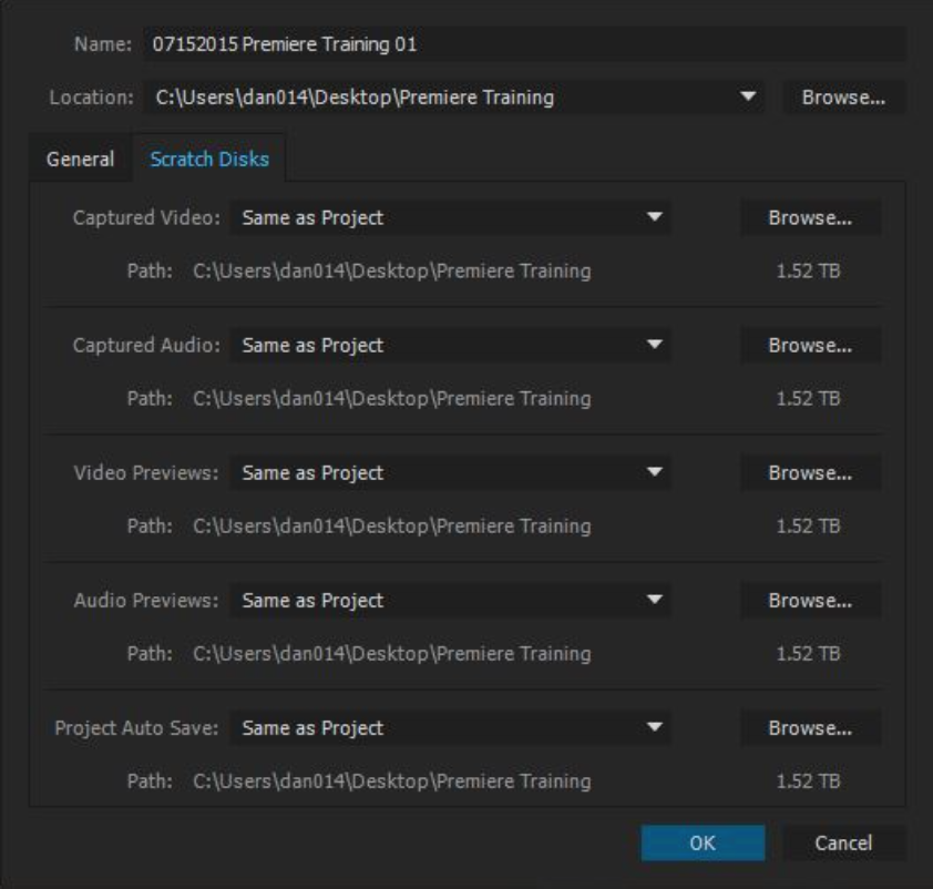
When you do open up Premiere, you’ll want to create a new project.  Be sure to give it a descriptive name – I like to incorporate the title, approximate date, and version number (for example, “Bucknell Convocation 11-2016 v01”).  Set the location to your project folder – the same place you’ve been putting your folders of media.  Finally, click over to “Scratch Disks” and make sure that they are all set to “Same as Project.”  This will ensure that Premiere stores all of its files in the same place.
Screen Shot 2016-08-30 at 2.38.06 PM

Once you have your files in Premiere, it’s a good idea to do some further organization via renaming and bin creation.  I do not recommend renaming files before you import them, because that can make it difficult to relink them if you need to go back to the originals.  Instead, I’d suggest renaming your files within Premiere, which only affects how the file’s name appears within the program – it does not change the name of the file in your project folder.  To rename something, either use a slow double-click, or right-click and choose “rename.”

With your files renamed, you can begin to sort things into bins, which behave just like folders – you can create a new bin by clicking the little “folder” icon at the bottom of the project window.  At the very least, you should have bins for your footage, music, stills, and other categories of media.  If you’re working on a more involved project with lots of media, you will probably want to create bins within bins – for example,  bins for different locations or shoot days within your footage bin.  It can also be useful to color code your media, which you can do by right-clicking and choosing “label.”

Depending on the footage you’re working with, one last organizational step you may want to tackle is the creation of subclips.  Subclips are useful when you have a long clip that you want to use multiple pieces of.  If you double-click on a piece of video footage, it will open in the Preview Window.  This is where you review your footage before dragging it to the timeline and beginning to edit.  In the Preview Window, you can use the “I” and “O” keys to set in and out-points around sections of the footage.  You can then right-click and choose “Create Subclip.”  Subclips appear with the rest of your media and look like new pieces of footage.  They exist only within Premiere – again, the original files are not being duplicated, moved, or modified.

Before you can do any editing with your newly-organized media, you need to create a sequence in the Timeline.  The easiest way to do this is by right clicking on a video clip in the media window and selecting “New sequence from clip.”  This will create a sequence with the same resolution and frame rate settings as the clip – so a 1920 x 1080 video with a frame rate of 24 frames per second will create a sequence with those settings.  You can use multiple resolutions and frame rates in the same sequence, but you should create the sequence using a clip with the settings you want for your final project.  You should also rename your sequence, since it will automatically reuse the same name as whatever clip you created it from.

When you’re ready to start editing, you should carry your organization over into the Timeline sequences as well.  The timeline is made up of layers, or “tracks,” and you can create as many as you want by right clicking and choosing “Add Tracks.”  It’s generally a good idea to put different types of media on different tracks – for example, if you were editing a video of interview footage with some stills used as cut-aways, you should put the interview footage on one layer and all the stills on another.  On the audio side, I like to have a track for in-camera audio, a track for externally-recorded audio,  a track for sound effects, a track for music, a track for room tone, and so on.  Because video tracks can be hidden (by clicking the “eye” icon) and audio tracks can be muted or soloed (by clicking “M” or “S”), organizing your media by tracks allows you to check the different parts of your project quickly and easily.

Basic Editing

Now that we’ve spent some time getting familiar with the Premiere workspace, we’re ready to move on to actually editing a project.  If you already have some editing experience, you shouldn’t have a hard time adapting to working in Premiere.  If this process is new to you, the best thing to do is to just mess around with the program.  The good news is that all video editing programs operate in generally the same way – so if you learn one, you can probably figure the rest out.  They all have their own quirks, but the process of actually editing video footage is pretty much the same.

The simplest way to edit is by grabbing the clips in the Timeline and moving them around.  If you grab the beginning or end of a clip, you can shorten or lengthen it.  Using the razor blade tool (keyboard shortcut C) will split a clip.  If you drag one piece of footage onto another, the new footage will “overwrite”  the old footage (which will disappear from the sequence).  This is called an overwrite edit.  If you drag one piece of footage onto another with the command key held, all the footage after the edit point will slide down and the new footage will be inserted there.  This is called an insert edit.

These relatively simple actions are the basic building blocks of all video editing.  Everything else is secondary, so be sure to get comfortable moving media around in this way.

Every editor has a slightly different style of working.  I like to start with large chunks of footage in my timeline, then rearrange and block out the piece as a whole.  When everything is in roughly the place I think it belongs, I make successive passes through the footage, refining and tightening things up as I go.  On each pass, I try to be increasingly critical about what stays in the edit.  After several iterative edits of the raw footage, I add transitions and keyframed effects.  Fine audio adjustments and color correction are usually the last steps.

Transitions and Effects

Premiere has a variety of different video and audio transitions built-in – wipes, iris simulations, 3D effects, morphs, and more.  Occasionally, for a very specific kind of project, these are helpful.  Generally, though, they’re garishly cheesy and most of them should be avoided.  When you do use a transition, you probably want to do so in a way that doesn’t call attention to the transition itself; it should enhance the footage, not distract from it.  Use them sparingly.  Your best bets are the simple ones – either a cross-dissolve or a dip-to-black.  Even these can be visually tiring if overused, however.

You can add a transition by dragging it from the appropriate drop-down in the Effects menu.  A transition can be placed either at the end of one piece of footage or between two (provided there is no gap).  You can right-click at the end of a piece of footage and choose “Apply default transition.”  This will add a simple cross-dissolve to both video and audio.  This can also be done by highlighting footage and using the Command-D shortcut.  You can adjust the parameters (length, etc.) of any transition by clicking on it and using the Effect Controls window.

Effect Controls is also where you adjust the various properties and effects of the media in your sequence.  If you click on a piece of video, it will show up in the Effect Controls.  You should see a section called “Motion” near the top — this is where you can change the scale, position, anchor point, and rotation.  The opacity controls are there as well.  You can use these settings to adjust the framing of a shot, or for more creative effects such as split-screen and overlays.  Any other effects that you add to your footage will appear below the default adjustments.  Effects are applied in the order they appear, which can change the overall look of the footage.  For example, if you apply a color correction and a glow, switching their order will alter the final result.  Effects can be reordered, as well as copied and pasted (although only one at a time).  Under the Audio section are controls for volume and pan.  We’ll go more in-depth with audio effects next week.
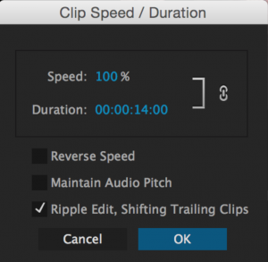
Screen Shot 2016-08-30 at 2.43.13 PMTo change the speed of a clip, right-click on it in the Timeline and choose Speed/Duration from the drop down menu.  Adjusting the speed to over 100% will make the clip speed up; adjusting the speed to less than 100% will make it slow down.  You can also reverse the clip using Reverse Speed tick box.  Be aware that your footage will start to look choppy if you slow it down significantly. One important option in the Speed/Duration window is the Ripple Edit, Shift Trailing Clips tick box.  Checking this box will move all proceeding clips in the sequence relative to the new duration of the clip you adjust.  So, if you change the speed on a 5 second clip to 50%, that clip will become 10 seconds long.  If you check Ripple Edit, Shift Trailing Clips, no existing clips will be overwritten – instead, they will just move down the timeline.

Exporting

When your draft is finally finished, you’ll need to export it.  The first thing you should do is set an In and an Out Point around your project.  If you don’t do this, Premiere will export everything in the current sequence.  You bring up the render options by choosing File>Export>Media… from the menu bar, or by simply pressing Command-M.  There are a ton of render format options and if you know what you’re doing, you can really define all the parameters of your finished video file.  Premiere also gives you lots of useful presets, though.  For video that will go on the web, the H.264 format does a great job.  If you plan on uploading your video to a streaming site, such as YouTube or Vimeo, you can select one of those options from the Preset drop-down menu.  The YouTube and Vimeo presets generally do a nice job of keeping the file size manageable and the quality of the video high.

Before you export your project, you should click on the Output Name to input what the file will be called and where it will go.  It may be a good idea to create a sub-folder within your master folder just for rendered video.  Most of the other options in this window can be left alone, at least for now.  You have two options for rendering the video – if you click Queue, you will bring up the Media Encoder program and it will load your project.  This is fine, but it’s a bit more complicated than is strictly necessary.  If you click Export, the video will begin to render within Premiere.  When it’s finished, be sure to watch it in its entirety to make sure that there weren’t any errors in the exporting process — it does happen, from time to time.

Project 2: Start Cutting

The best way to really learn a program like Premiere is to just start using it.  Download the media at this link, then set up an organized project folder and Premiere file.  In the folder, organize the media by type – stills, footage, sound effects, and music.  Import all the media into Premiere and organize it there as well – create bins and rename the files so that they make sense at a glance.  With everything set up properly, create a timeline sequence and make a simple video project.  It doesn’t have to be brilliant – or even coherent – I just want you to familiarize yourself with the tools, interface, and process of editing in Premiere.  Make something between 30 seconds and a minute long, then export it using the 1080HD Vimeo preset in the H.264 format.

With that done, take your project folder with everything in it (media, Premiere file, exported project, etc.), compress it (on a Mac, right click on the folder and select “Compress”), and upload the resulting zipped file to your Google Drive.  You should then be able to send me a download link to that file.  If you’ve organized everything properly, I should be able to unzip the file and open your project on any computer running Premiere.  This assignment is as much about media organization as it is about editing, so I want to see your project folder and Premiere file in addition to your finished piece.

I realize that this is a lot to take in, especially if Premiere is new to you.  If you find yourself stuck, feel free to contact me – I can either help you troubleshoot over email or set up a meeting to go over things in person.  Be sure to send your finished assignment to me by the morning of Thursday, September 8, so that I can look over everything and get stuff posted before class that day.  Have fun!